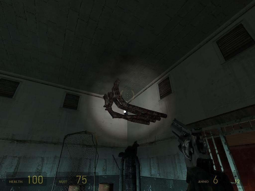
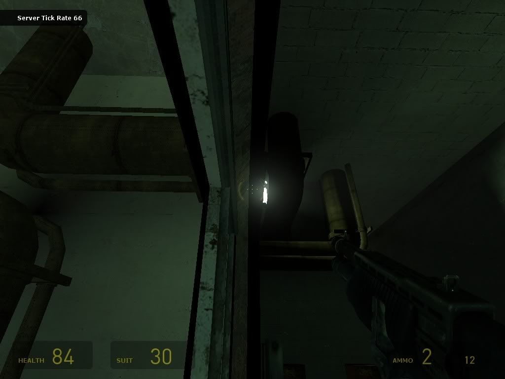
NEW MAP! DM_Remorse

[EYE] Valar

2008-10-10 01:46:39

DM_REMORSE

Play @ 8.2.120.232:27015
DL @ http://www.eyeclan.net/eyeden/hl2mp/map ... b3.bsp.bz2

this is in beta stage.

Image
Image
Image
Image
Image
Image
Image
Image
Image


val

haymaker

2008-10-10 04:16:09

Played a quickie on this yesterday, liking a lot. Some far-flung distances but easily navigable. Not so sure about the red hl2 texture, that one always looks bunk to me, you could make a better one I'm sure

[MB]Brunt

2008-10-10 05:54:57

only had few mins to run around it but it looks nice good fps.let ya know more what i think when i get a chance to frag in it :D

{EE}chEmicalbuRn

2008-10-10 18:24:11

map is money IMO. i dont mind the red, it's nice to see a map with something a lil different then the norm. well done Valar, another brilliant map my friend.

badinfluence

2008-10-10 20:08:03

I just ran around in this map when you guys were AFK.

[EYE] Valar

2008-10-10 20:25:38

{EE}chEmicalBurn wrote:map is money IMO. i dont mind the red, it's nice to see a map with something a lil different then the norm. well done Valar, another brilliant map my friend.
not forgetting Chem's suggestions and emphasis on connecting the far areas as they are now. thank you very much man.

val

Shoobie

2008-10-10 20:47:10

I played it yesterday, i think it worked nice practicaly as far as i could understand. I'll need to check it out on my own though. I was mostly running around, but i think i almost got the map at the end of the session. NIce game there dudes!

cyboy bunny

2008-10-11 00:06:57

where do you get the time from to make all that nice maps?.
had a quick run through the map,looks like a fast and fun to play map but i got a few points that i did not like.
1 the light/power cables in the main part looks unreal. one cable is going right trough a ladder so the player goes through the cable. the cable entrance in the power box is strange (right into the front plate) and also how the cable is going through a pillar looks strange. and you used the dame type off cable on the hanging platform. i think the mounted electrical wire models looks far more real for the lights.
2 the pipe cluster on this pic looks to me very strange. its like the pipes are floating.you placed a decal above them on the ceiling but it does not fit for me.Image
3 and sorry yes again a pipe ,this one is going through a thin wall and on the other side he does not come out.Image
4 the hole in the ceiling in the main middle part is so uhhh neat and uhhh six(8) sided. the rest off the map is looking more aged/collapsed and this hole seems off it is brand new.

sry for the comments,but overall i am jalours again.

good luck :wink:

cyboy bunny

2008-10-13 19:53:04

ohh yes ,there is a spawnpoint nearby a radiator where you can stuck in the radiator when spawning. its in a room where also the ar2_allfire laying in the same corner.

good luck :wink:

[EYE] Valar

2008-10-15 00:31:36

all will be fixed in next ver cyboy. apart from the cable issue...i mean...cmon :)

thx a bunch for the indepth inputs. i appreciate it.

val

Cynips

2008-10-15 17:31:41

As always really nice looking, great atmosphere and all.

From the little I ran around in it I have basically two things to comment on:

1) There are some stairs that are parallel to elevators. This seems counter intuitive to me, as in: why would you want to have the stairs at all when there's no fall damage anyway?

2)
a. If you want it to be a competitive map you need to seriously reduce the amount of weapons, ammo and props. There is hardly any reason to try to control these resources in order to deny them to the enemy otherwise. If you decide to take out some weapons I suggest you try to reduce the most powerful ones first. There are too many insta-kill weapons as it is - props, balls, smg nades, rpg, mag and shotgun headshots... Insta-kill is fun on public servers because even the beginner will get a kill, but it introduces too much an element of randomness to have a place in competitive play.
b. Maybe also reduce available health and suit but this there are two sides to this. On one side you may want to do it so that they are controllable, but on the other hand it is never a bad idea to make players more difficult to kill in this game.

I haven't checked things like spawn points, so I don't have an opinion there. But once again, nice work - reminds me somewhat of some quake 1 maps of days gone by :)

[EYE] Valar

2009-04-30 20:25:29

DM_REMORSE_R1 is out. i will playtest it for a few days before (if any problems arise) _FINAL will be released.
Weapon placement redone from the ground up, as were many sections of the map.
The upper Supercharger area was modified to make it harder to camp - and Reach. alongside added a new wall to block visibility from supercharger to RPG's air shaft. Supercharger now requires a nice jump to get to and is pretty much opened as can be to be taken down.
Deviated completely from the LD style and replaced pretty much all textures.
Reduced physprops
Map is pretty low in armor
Good amount of HPs
2 AR2 + 3 CB (one is sort of hidden + out of path)
2 Mags
1 RPG - same as it was (added a playerclip step to help get inside it.
3 xbows (might be 4 i don't remember now)
5 Shotties - again i hope i remember correctly.
Lighting completely replaced from the ground up and the map now makes a lot more use of shadows and artificial/natural lights.
Changed time of day to dusk.
Removed the annoying green lighting which seemed to get on everybody's tits lol. sorry i have no idea what i was thinking at the time.
Added quite a few xbow banks in corners.
Removed all Stairs and replaced with diagonal ramps.
Glass windows are all breakables.
Tried as much as i could removing items from floor to avoid them getting in the way of xbows.
All spawn point afaik are no longer getting stuck with items.

I've still to make sure of the following:

Is the map too dark?
Are there too much props?
Are 3 CB too much?
How is the map flow working for ppl in general?

As i said, i will be doing some intensive playtests in the next few days so join me on my server and take a look. i'll try to arrange 3v3 and 4v4 on it. talk on steam.

Some sexual screens :

Image
Image
Image
Image
Image
Image
Image
Image
Image
Image
Image
Image
Image
Image
Image
Image


Thanks to boshed for the lightmap and smoothing class. you always rock thx m8.
Thanks to Chem who is responsible for the connectivity in this map.
Thanks to AIR, Chem, LukeGT, Geier and everyone else who's names escape me atm and helped playtesting Remorse in the past.
A Big Thanks to all the h8rs - you people just make mapping so much fun. I'm a better person because of you're love and support.

:wink:
val

boshed

2009-04-30 21:01:27

I'd just like to say "zomg". <3 the lighting, cant wait to play this one.

[EYE] Valar

2009-04-30 21:09:40

Map will be playing 24-7 on
Server : [EYE] Server ( Deathmatch) [Fast D/L]
IP : 66.55.158.70:27015
PSWD : woot


enjoy :!:

Paradox

2009-05-01 02:35:20

Valar do you have an updated link to it? Are you still beta testing and changing or is this the final version you think?

[EYE] Valar

2009-05-01 03:21:47

'im compiling r2 now based on feedback from today and will upload in a few min. ill shout u.

Da1

2009-05-01 08:24:58

wow this looks like a completely different map, pure win as always, ;)

haymaker

2009-05-01 10:24:25

hollashit that's a facelift! Beauty screens. Lightmaps ftw, new textures are big improvement, nice effects. I always like playing this one too.

idk about changing the stairs, detracts from the impression for me. Can't just put clip ramps/func_illusionary brushes?

[EYE] Valar

2009-05-01 18:39:13

thanks hey.
bout the stairs..play the map and see for yourself. i think the ramps are way sexier. plus the added bonus is interesting xbow banks you cannot archive with atairs.

Blasphemy

2009-05-01 22:55:16

you can never have enough cballs.

Pig Popper

2009-05-05 21:54:48

coudlnt see a dl link, and the server was giving a "missing map error" help us out V :sketchy:

[EYE] Valar

2009-05-05 22:54:12

that might have been earlier yesterday evening perhaps?
it's running and DLing fine now. but anywys wait a few, i'm uploading a newer ver one now.

Pig Popper

2009-05-06 02:36:48

[EYE] Valar wrote:that might have been earlier yesterday evening perhaps?
it's running and DLing fine now. but anywys wait a few, i'm uploading a newer ver one now.
Sweet

[EYE] Valar

2009-05-06 06:59:47

took a bit longer today...

r5 is on server ip: 66.55.158.70:27015 (TDM)
pswd: woot
feel free to scrim on the server or on your own LOCKED server. i'd appreciate not finding the map running on pubs before release. please :D
inputs are more than welcome. thx

val

haymaker

2009-05-06 09:21:02

just had a lil 1v1 game on that ip. OUT-STANDING map is so many ways! Fast becoming one of my favs so far this year. That you've managed to pack so much atmosphere in here while still keeping the frames high is amazing. I laughed every time I fought on the the 2-story ramp-lift combo too.

One very noticeable thing occuring on my end, in the area where the dynamic lightmaps are @ the rocket entrance: wierd kinda lag-but-not-lag, kinda stuttery like the engine was swapping out the info or precaching it every few frames. net-graph showed good numbers but there was a definite issue, to the point where weapon swaps were lagging. Would probably be pretty nasty if there was 4 or 5 players in view.

The other player noted that one of the lifts seemed too fast but I didnt really notice.

Your light-shaft work I found a bit overbright in a couple areas, worked against gameplay a bit.

For its size this is really farkin fast. I'm unsure of its suitability for 1v1 but I had no issues getting places, it seems easy to learn.

As for my other comment about the stairs, I'm still stickin' to it. I like the ramps and the reduced triangles tbh but stairs+invisible seem more immersive of an approach visually.

And visually this is a stunner! I'll be stand-and-stare at this a few times in the future I can tell ::)

[EYE] Valar

2009-05-07 06:55:41

Thanks for the inputs. i took all into consideration and fixed.
R6 is up now. last thing to do is the RPG room;

I've removed the RPG air shaft and replaced it with a room. room is filled with toxins to avoid camping. the trick now is to set the hurt values just right so u have enough time to get in and get out but no more than that.
I'm happy that the RPG and Supercharger are a bitch to access and i think this adds to the map greatly.

[EYE] Valar

2009-05-08 17:35:58

This is DM_REMORSE_PREFINAL
Remorse is a new map...i mean...old, old map...i mean...old-new map...err...remorse is a great map for 2v2 with an easy learning curve. smooth gameplay and pretty fast to run around in.
Includes:

1 x RPG - in a room full of radiation. so grabbing RPG inflicts damage. Getting inside the RPG room sounds off the NovaProspekt VO across the map. this is BTW the only alert in the map. i've removed them all per playtest and left only ambient/ environmental sounds.
Supercharger spot placed behind a far jump and opened for attacks.
2 x AR2s
3 x CBs (orb) - which one of the CBs is well out of sight and hard to get.
2 x XBOWs
2 x MAGs
low in armor and hi in HP
4-5 Shotties
good amount of grav nades + nade crates
The map is very well connected and there is always a 2nd or 3rd route from everywhere.

enjoy and keep the inputs flowing. it will stay in Prefinal stage until i know this is where the map should be. then ill compile dm_remorse_final.

thanks for all the help with this baby. i am VERY proud of this one.
thxbai.

val

[EYE] Valar

2009-09-30 15:03:25

haymaker

2009-10-02 03:24:14

Easily one of my fav maps this year

The renovation to the high ar2/trunk-room seems like a good idea.

I'm ambivalent about the other major change, to the long ramp/lift section. I remember alternately cursing and laughing at it before. Now I cant roll nades up the hill so far either, maybe that's a good thing

Monarch

2009-10-02 11:06:50

first i saw it i was like :sketchy: uh again lockdown maps, but this is crazy game-style map. i was just flying on it, good work, Valar!!!

[EYE] Valar

2009-10-03 01:01:52

all props go to LukeGT for his inputs.

Ade

2009-10-03 12:46:54

Haven't had a chance to play it yet, the server in your first post says it's not responding. But I've walked a bit through it and it's got a bit of a warm feelin to it, maybe cus of the lightin and smooth stairs. Feels nice just walkin through it, ya know? Is it supposed to be like that in a prison? :)) I love the health pickups placement :D Props and ammo are also well placed, but it takes a while to learn them (I'm usually a fast learner, but there are exceptions and this is one of it; because of the multiple routes, it felt like I was runnin around in circles and couldn't get where I wanted right away..) And I even managed to get to the supercharger by using props, so thx for the props ;) But I didn't like the 2 similar holes in the ceiling - one in the room with the nade & ammo crates and one in the ar2+orb room - to me it looked like they were in the same upper left corner of the room, even if they are somewhat different. Also, I noticed most of the shadows are cast on the walls, but not on the floor, even though light comes directly from above. First noticed this in the room where the fall does no damage, but I think it applies all throughout the map.
Sumthin odd came up in certain angles in noclip, see attachment :D What is that? EDIT: removed pic, cus it ruined the flow of the page. Been in noclip for a few times, but never noticed anything like that, sry
Other than that, can't wait to play it :D

[EYE] Valar

2009-10-03 13:29:44

- this is the skybox texture, nothing odd about it :)

- shadow reflects on walls or wherever it does is a direct result of the light enviroment in the map. i didn't change or played with multiple sunlight angles. this is a virtual "normal" dusk lighting.

- the holes in the two rooms are completely different.

- the map is not a labyrinth, you can learn it by playing through it a bit more. not all maps are "in your face" simple. but no doubt there are far more complex than this one.

- thanks for your inputs. enjoy.

boshed

2009-10-04 13:05:20

Really fun map for 2v2. boshed likes!

Beef

2009-10-17 06:20:46

Nice work, Val!