dm_technic

ninjins

2009-01-06 13:44:14

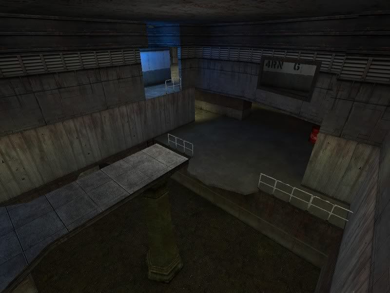
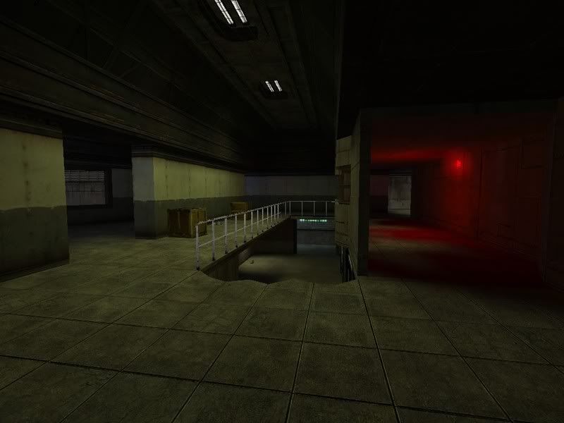
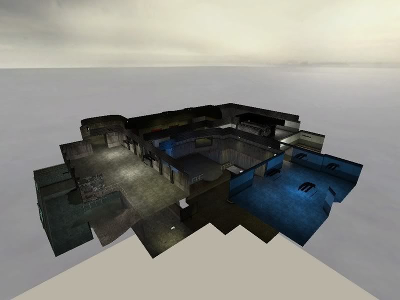
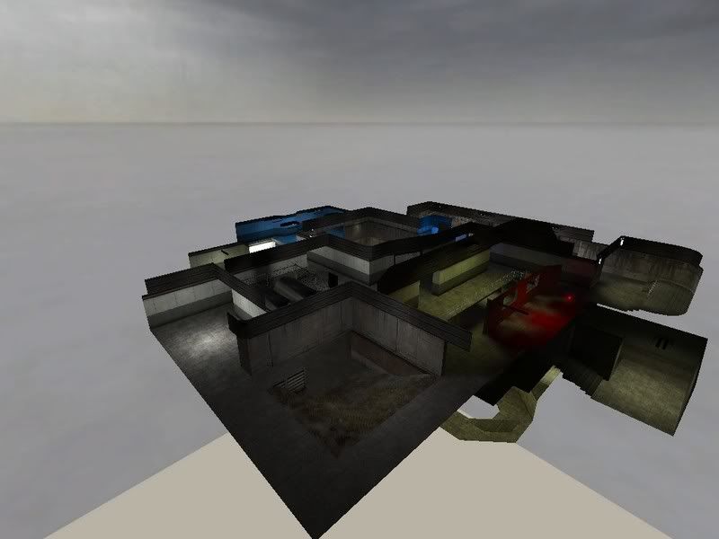
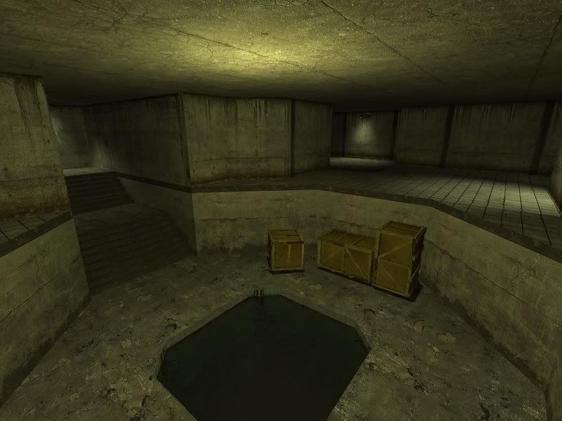
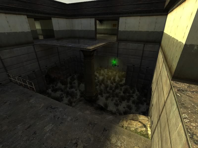
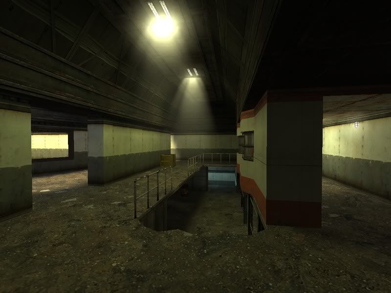
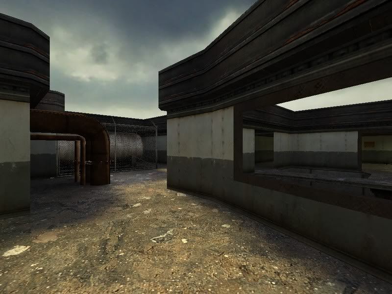
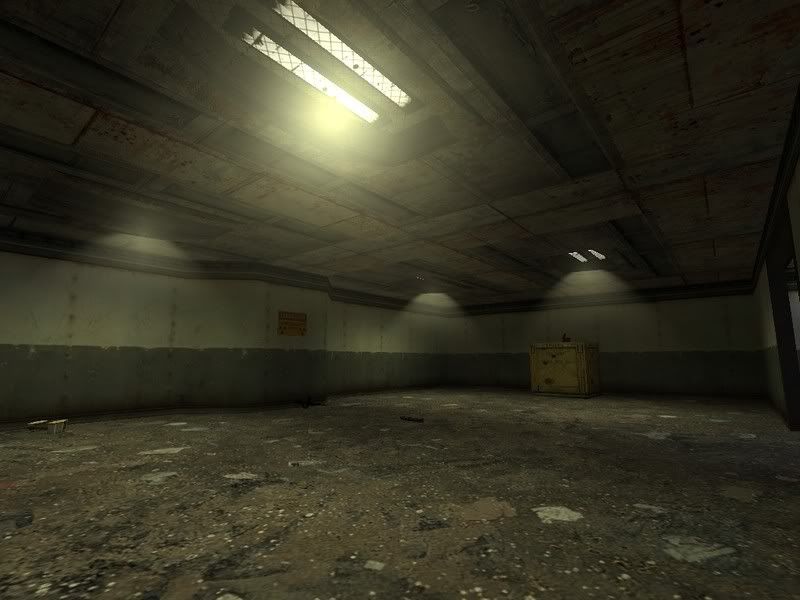
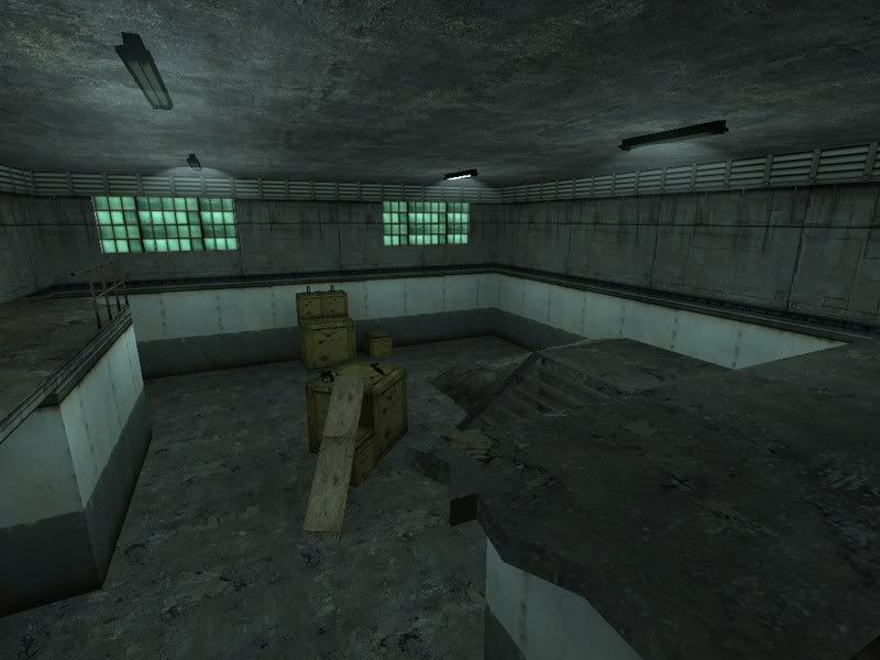
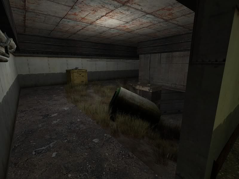
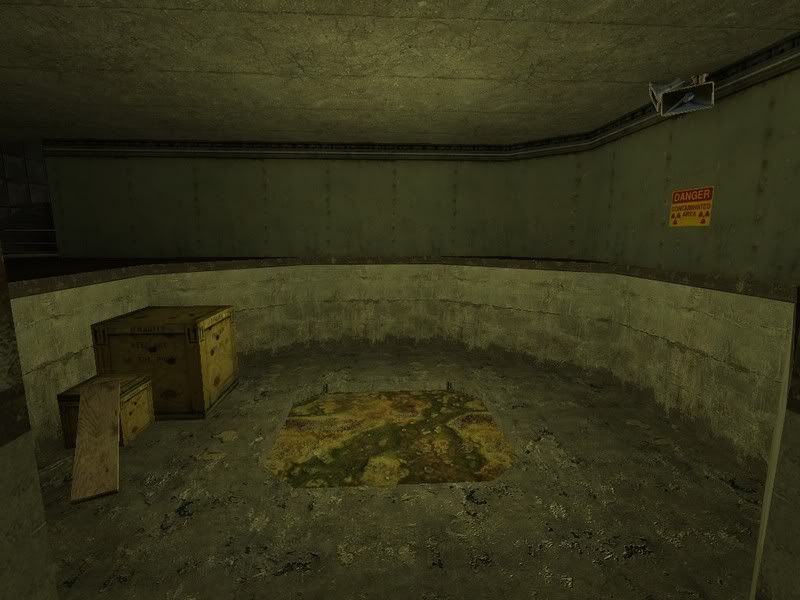
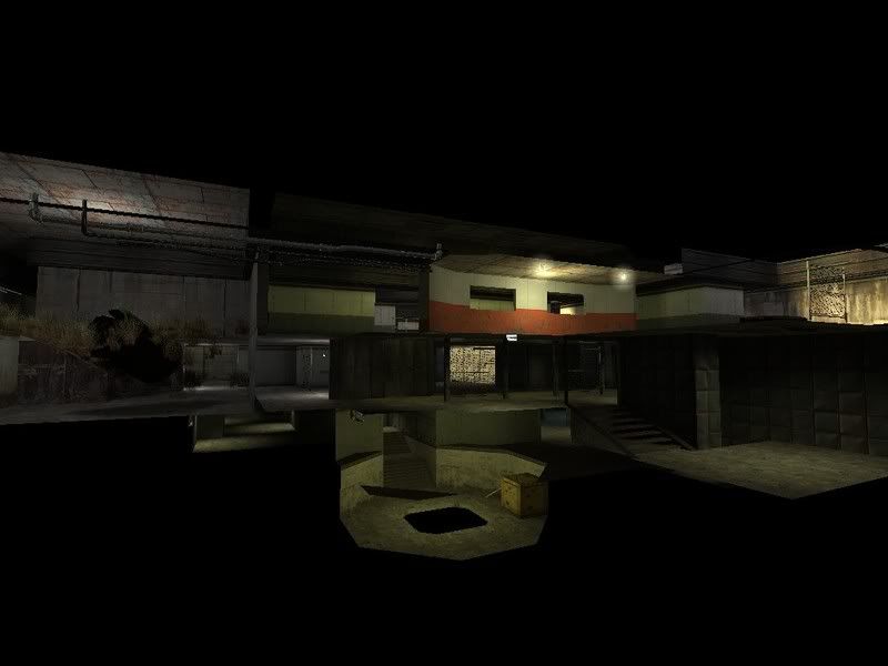
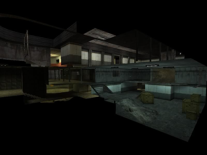
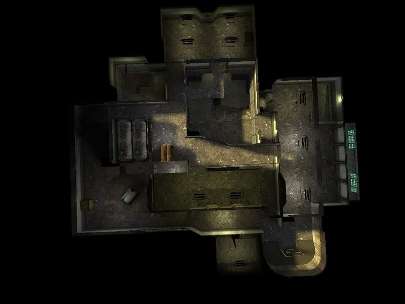
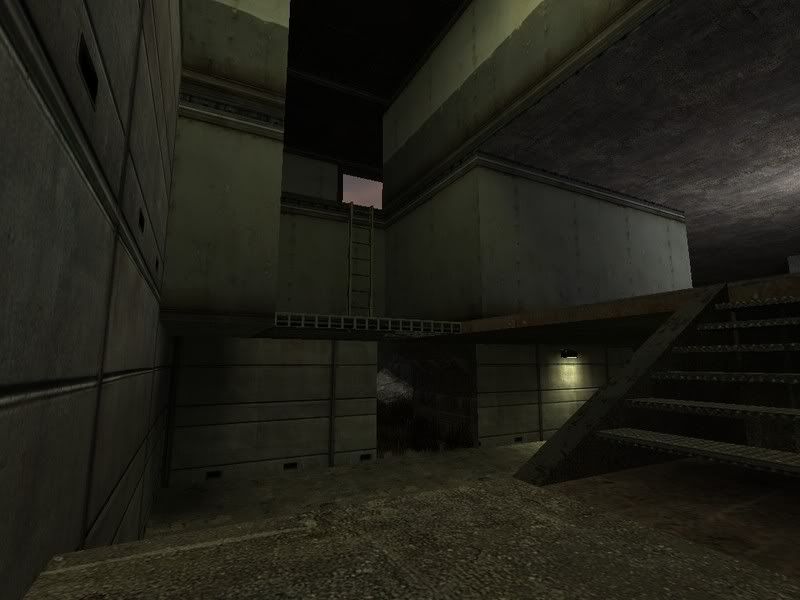
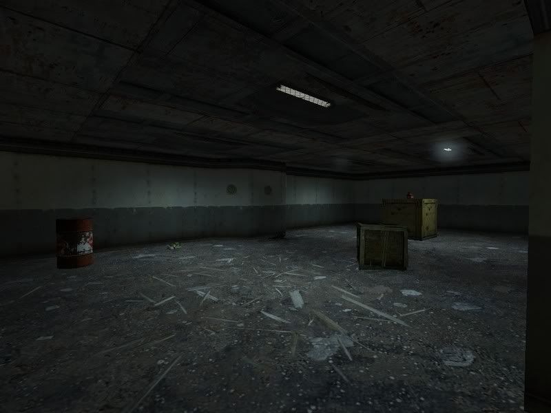
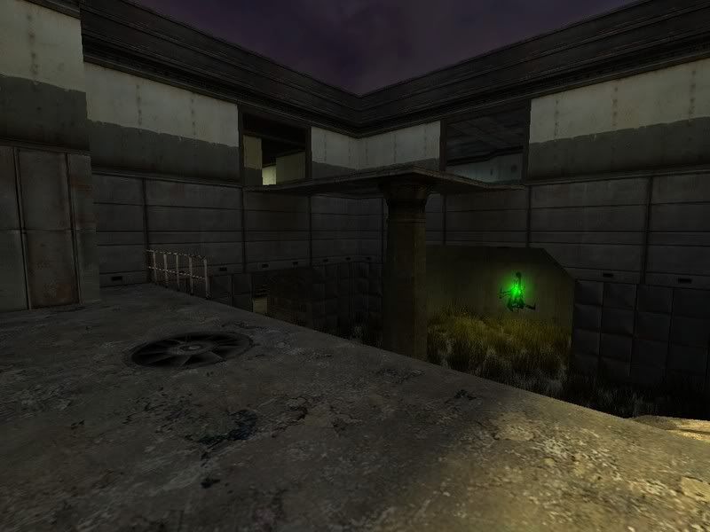
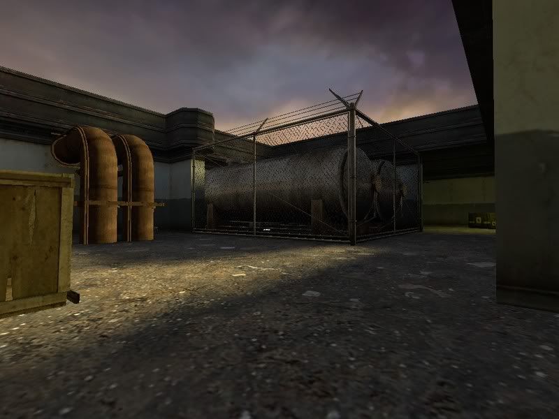
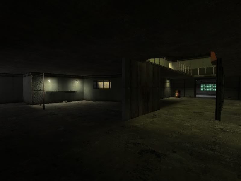
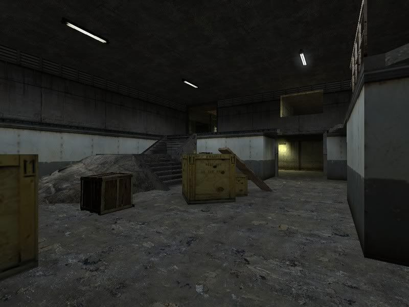
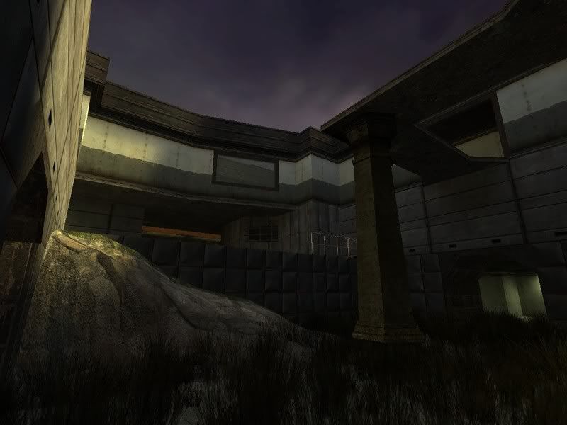
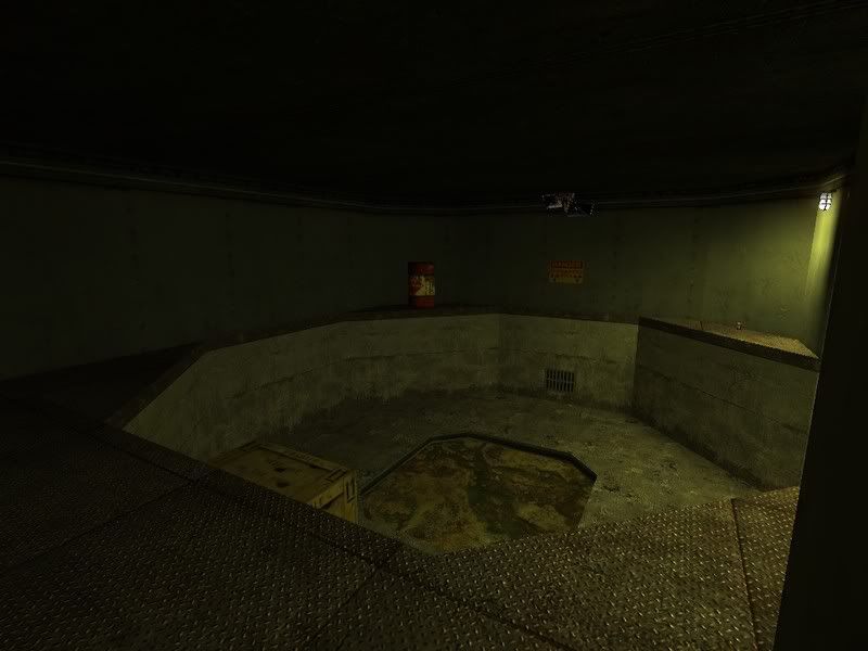
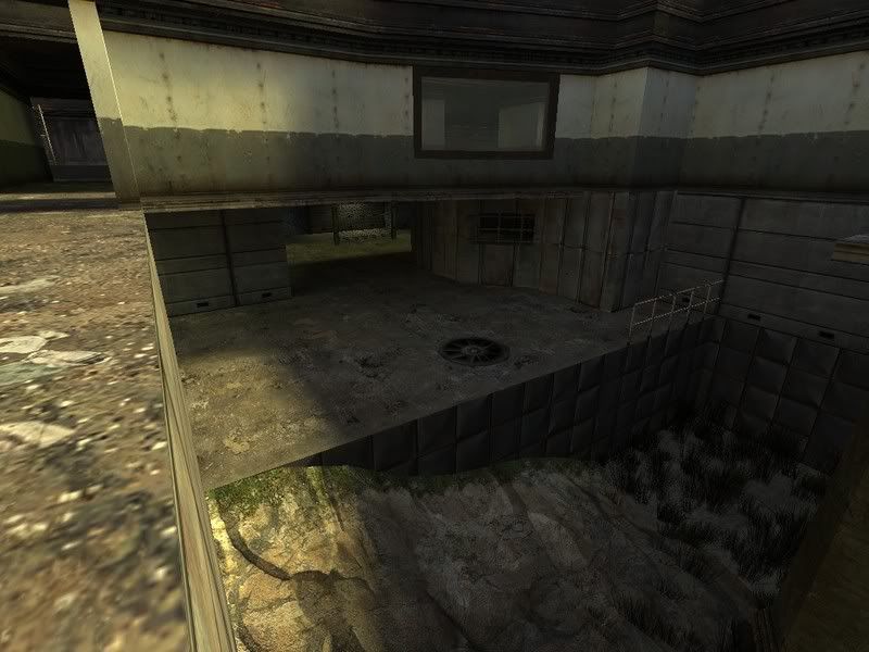
Since this was a map idea I've actually felt like finishing, here are some screens showing the rest of the map off.

I'll be releasing a beta test soon I promise.

Once again sorry the screens are so dark, I'm still working on the lighting, but more importantly to me, the weapon layout at the moment.

Update:

http://files.filefront.com/dm+technic+b ... einfo.html

I need extreme competition criticism. I know the lighting is bad. Theres still a few areas I dont even have sources for which there is lighting. Im more or less worried about the weapon layout and overall flow.

GLHF

Image

Image

Image

Image

Image

Deathwish

2009-01-06 14:04:00

i think this looks great keep up the good work :)

Paradox

2009-01-06 17:19:10

Looks good Tiggy keep it up.

badinfluence

2009-01-06 17:25:00

I remember you posted this map forever ago.

{EE}chEmicalbuRn

2009-01-06 19:55:27

ya man, that map looks kick ass. nice work. when is the release date?

CellarDweller

2009-01-06 20:35:16

the overview reminds me of caverns. should be sweet! :D

reaper47

2009-01-06 21:28:42

Looks nice.

It's had to comment on layout from screenshots but it seems you didn't fall for the mapinnabox-trap, so it feels OK!

One tip: Don't rely on lighting for color. Having blue and green and red lights everywhere, without any apparant reason, just makes it look like some kinda depressing 80ies discotheque. Rather use consistent lighting, white (but with subtle shades of yellow and blue for atmosphere).

To keep navigation and recognizability for each area, replace the gray walls themselves by more interesting ones. You could also experiment with lighting styles, like using lots of little spots, floor-mounted lights, sky, etc...

ninjins

2009-01-07 01:06:23

Thanks for the feedback!
reaper47 wrote: One tip: Don't rely on lighting for color. Having blue and green and red lights everywhere, without any apparant reason, just makes it look like some kinda depressing 80ies discotheque. Rather use consistent lighting, white (but with subtle shades of yellow and blue for atmosphere).

To keep navigation and recognizability for each area, replace the gray walls themselves by more interesting ones. You could also experiment with lighting styles, like using lots of little spots, floor-mounted lights, sky, etc...
Well unfortunately I dont want my map looking like a texture horror fest so I tried to blend textures into the next areas so that it actually looks good. Some people can pull off random ass textures on every wall and have the map still come out right. (dm_caverns_r1) So yeah, I tried to actually have it look like a decent map as far as artistic styles go. The lighting is there for atmosphere. It's also to help differentiate the areas (not that it would be that hard, I designed it in a way so that should be rather easy anyways.) But yeah I'll see if I cant leave the lights at more of a whitish yellow. Im still not sure how I'd have regular white light coming from the sources themselves and have atmospheric blue or red lighting in the same area without having a blue or red light source.

Once I fix some of the bland areas and fix my ceiling lights to look right, I'll release a beta.

The hardest part about this map is the damn weapon layout. I can never find one that I think will work. So I should probably just stick with the one I have and see what everyone else thinks first.

Sadist

2009-01-07 02:21:42

Looking very nice, will be interesting to see the layout at a closer look soon.

haymaker

2009-01-07 04:44:46

look nice and fast, good job :)

to continue reaper47's line of thought watch out for misaligned textures, ie that vent-strip in pic1

hard to say without running around around but looks like the railings might cause a bit of frustration here and there, but perhaps you've figured that into gameplay ideas

ninjins

2009-01-07 05:32:22

Whats wrong with the vent texture? Are you talking about how it doesnt align with that opening on the upper left?

Unfortunately whilst making this map and changing so much through i have alot of bad unit sections. Had I actually planned this map out thoroughly I'd be sticking to measurements of 8. walls would be 128 units high etc. Well come to think of it most of my walls are exactly 128 units according to textures, but the width may not be correct to units of 8. Shouldnt cause too much of a problem. More so of a problem if I had to fix that. lol. Theres absolutely no way I'd be able to get the entire map into units of 8.

herbalizer

2009-01-07 09:39:04

I like the looks of it so far, can't wait to play a new map! :)

boshed

2009-01-07 10:41:00

TiGGy wrote:Unfortunately whilst making this map and changing so much through i have alot of bad unit sections. Had I actually planned this map out thoroughly I'd be sticking to measurements of 8. walls would be 128 units high etc. Well come to think of it most of my walls are exactly 128 units according to textures, but the width may not be correct to units of 8. Shouldnt cause too much of a problem. More so of a problem if I had to fix that. lol. Theres absolutely no way I'd be able to get the entire map into units of 8.
Cover stuff like this with some little func detail trims etc :D

Looks like a nice free flowing layout, also can't wait to have a play on it with some people.

[KBH]Tazzer

2009-01-08 06:30:50

looks really nice man!!!

ninjins

2009-01-10 09:49:04

BUMP.

Paradox

2009-01-10 17:27:31

Tiggy when I get a chance, I will download it, put it on my server and take a look.

haymaker

2009-01-10 19:41:13

Is this your first map? If so this is probably the best "first map" I've ever seen, I totally dig the layout! Really nicely done, beats the shit out of my first map.

I can't comment on item placement too much, cuz I'm not great at that stuff, seems fine to me. Maybe the rpg doesnt need to be so deep, there's so many twists and turns locally anyway, idk. And personally I am not a fan of climbing boxes to get somewhere, you could leave the boxes and put a playerclip ramp, I don't think I would ever try using the boxes if I had to climb them in a game.

My main suggestions are aesthetic, you are so close to getting it to the next level, it would be a shame not to pay attention to a few details here and there.
-my biggest concern is your texture usage, pleez spend a bit more time there, it will be worth it...ie that vent texture is a must do; you have dirty walls on clean floors; why is there grass inside there by the orb? ( dirt? ); putting a garage door would answer why that big pipe is inside the building there; etc
-I know you've mentioned lighting not being finished but it occurred to me it would facelift the big cavern to replace the ceiling with skybox, have the light_env come in at 75 deg or so

Anyway sorry for the long post, but I am really impressed by the flow and performance of it, it really isn't a lot more work to put a bit of spit and polish on it. I'm not a detail freak but a certain level of professionalism will be something you will be glad to look back on later

ninjins

2009-01-11 10:47:39

haymaker wrote:Is this your first map? If so this is probably the best "first map" I've ever seen, I totally dig the layout! Really nicely done, beats the shit out of my first map.

I can't comment on item placement too much, cuz I'm not great at that stuff, seems fine to me. Maybe the rpg doesnt need to be so deep, there's so many twists and turns locally anyway, idk. And personally I am not a fan of climbing boxes to get somewhere, you could leave the boxes and put a playerclip ramp, I don't think I would ever try using the boxes if I had to climb them in a game.

My main suggestions are aesthetic, you are so close to getting it to the next level, it would be a shame not to pay attention to a few details here and there.
-my biggest concern is your texture usage, pleez spend a bit more time there, it will be worth it...ie that vent texture is a must do; you have dirty walls on clean floors; why is there grass inside there by the orb? ( dirt? ); putting a garage door would answer why that big pipe is inside the building there; etc
-I know you've mentioned lighting not being finished but it occurred to me it would facelift the big cavern to replace the ceiling with skybox, have the light_env come in at 75 deg or so

Anyway sorry for the long post, but I am really impressed by the flow and performance of it, it really isn't a lot more work to put a bit of spit and polish on it. I'm not a detail freak but a certain level of professionalism will be something you will be glad to look back on later
This is my first -released- map to any public. I have other maps I played around with just to learn hammer and a few people actually saw them. I may release them for poops sake just to hear what I already realize I did horribly wrong with them.

Dont worry about the long post. I wish it was longer even. This was exactly what I was looking for upon releasing this beta.

Originally the map didnt have those boxes that you "climbed". Only reason I eventually put them there was actually not even intentional to climb them. It was just for looks really. I mean of course you can still climb them if you wish, it's just a pain in the ass. Or may possibly get you killed just to take a shortcut instead of going up those stairs. I intend on leaving those boxes there or possibly more towards the middle of the room to keep people from thinking its supposed to be a smooth path to the top. I will not player clip ramps up the boxes for that is deceiving.

I will take a lot of your advice into consideration and play with those ideas a little bit. The RPG room/waterhole will end up triggering a sound when you touch the water and due to how cramp that entire area around RPG is, I'll end up shortening the hole like you suggested so that its not impossible to get due to the fact that by the time you hear someone go for rocket you can already be down there countering them.

As far as textures go, I've gotten mixed reviews. Some still say to totally randomize the textures for the sake of knowing where they are in the map. Easily recognized areas ETC. The way I see it is if you cant figure out the layout of this map within say, the first 10 minutes of wandering around, you've got serious problems and should be playing the map in a match to begin with. So with that said, I will put effort into the textures and trying to theme the place. Meaning I'll have alot of repetitive textures for sake of the theme itself. I'll be releasing a b2 soon for a better play test and possibly get a few people to 1v1 on it so I can see how it flows and controls.

"-I know you've mentioned lighting not being finished but it occurred to me it would facelift the big cavern to replace the ceiling with skybox, have the light_env come in at 75 deg or so"
Thank you for the suggestion. My original design had that and I didnt like it then but I really put alot of thought into having a few skyboxed areas and it seems like it must be done. my only problem is making the ceiling a skybox texture or creating a higher skybox ceiling for the sake of smg nades not just disappearing instantly. That part is up in the air still. (lol)

Last but not least:
"ie that vent texture is a must do"
Do you mean keep that texture or do away with it? Find something else?

Once again I thank you GREATLY for the feedback. Now if only others could do the same.........

....

ninjins

2009-01-12 14:47:18

Updated Screenies:

Image

Image

Image

Image

Image

Image

Image

Image

Image

Image


As you can see I've changed some more of the lighting, toyed with some different textures, and added more gameplay and details.

I'll have the b2 up soon.

[EYE] Valar

2009-01-12 16:01:10

Wow. what a change and what improvement. good job man! i love this. keep it up.

boshed

2009-01-12 20:11:04

Nice new atmosphere! I'll hold off on having a run around with some people until you get b2 up for download.

Quick comment on the visuals for now: the spotlight effect under the fluorescent strip lights looks a bit strange, suggest swapping them out for 3 glow sprites like this.

ninjins

2009-01-15 14:47:19

More New Screenshots:
(I'm actually becoming proud of this map)
STILL A MAJOR MAJOR WORK IN PROGRESS AS WELL AS A LEARNING EXPERIENCE FOR LEAGUE MAPPING

THE OLD RAMP LOOKED STUPID, THIS WAS MY BEST IDEA (input welcome)
Image

OLD CHARGER ROOM, NOW AR2 ROOM
Image

THAT IS A G-GUN/ANY GUN JUMP PAD (meaning any damage, including a blast from g-gun will send you up in the air)
Image

(I know the fence models dont look right. I'll change those to ones without barbwire)
Image

Image

Image

Image

Image

G-GUN PAD AGAIN.
Image

I'm very well aware of the fact that the lighting isnt fantastic, I'm still working on it and I plan on getting it to a realistic state. Well at least as far as lighting goes. If you see errors within these screenshots (ie: texture misalignments) no worries, I'll eventually get those fixed. I'm still in the midst of adjust the weapon layout and I think I'm getting close to something somewhat 'fashionable' for this map. I REALLY can't wait to finish it and I know all of you are oh so eager to play matches on it.

I've changed ALOT since b1 and I hope some of you appreciate the changes. As soon as I get the lighting to a state that I want it, I'll release the b2 stage of the map and get some 1v1's going.

(Once again, sorry for the poor lighting in the screenshots. I don't have time to change the brightness for the sake of hl2dm taking poopy SS's. I've been testing these maps with default brightness settings so there shouldn't be any problems.
Also, I figure most of you don't even use default brightness settings (I set mine to close to all the way up) but if at all possible give me some info on what typical brightness levels you use so I can come to a reasonable median for this map.

[EYE] Valar

2009-01-15 16:12:42

this is gorgeous.
last ss, the rock texture is flipped on it's side which is fine only make sure you won't see this grassy bit. doesn't make any sense.

<3 it!

reaper47

2009-01-15 19:05:17

Hey! I like how the map develops. Maybe I missed something, but do you have a download for the new beta? I'd love to check it out. I had a run through b1, and I have to say: I love the layout.

Here are some more thoughts:

First, I'd be careful with the lighting. Not just from an aesthetical standpoint, I think you got this quite well now. I'm talking about "dark spots". As a rule of thumb (and I had to learn this the hard way), everyone's monitor is about 3 times as dark as yours. Actually, it's a good idea to literally turn down your monitor to the darkest setting for some test runs. It's partly for technical reasons, partly a psychological thing: People don't care about lighting when playing, so, if they ever feel like a lack of lighting contrast made it difficult for them to see some player in a corner, it's the map's fault. And they'll hate you for it.

It seems overdone at first, but I found that gameplay-wise, the best way to light a map is to have seamless light sources for literally every square inch of the map. That means lights should overlap and there should never be any "true" shadow, no gap between two lights. This often means one light for every wall/corner of the map. That includes walls that aren't lit directly but still look "bright enough". They usually aren't. Especially for outside areas. The sun is the best light source you could ask for, yes, but the parts that aren't directly lit by the sunlight, the shady parts, are already too dark and need an artificial light source, even outdoors. Those parts usually look especially dark because of the stark contrast.

Sometimes "silhouettes" (a dark spot between two brightly lit walls where you can make out players easily against the background) do work, but mostly just lighting the hell out of your map is the easier way of avoiding too dark areas.

In short: Add more lights, you won't regret it. :D

About item placement: I'm not religious about it and you'd better listen to people who play HL2DM more competitively than I do. But here are some things I noticed:
Medkits are extremely powerful, probably the most commonly needed item in the game. So place them consciously. Avoid placing them next to good weapons or ammo, so people have to leave their favorite spots in order to refill health.
Instead of placing 3 items of the same type next to each other (it's tempting sometimes), just put there one. No need to force-feed players.
Place a weapon and its ammo far from each other. Again: Make people run!
Remember, there are more physics items in this game than exploding barrels and crates.
Make powerful weapon placements compete with each other. Like the xbow being in clear sight of the RPG or a combine-ball. And vice versa.

Last but not least: Build cubemaps. I haven't heard a good reason yet not to have cubemaps, in even the crudest beta releases. Place an env_cubemap in the middle of every room or major corridor, compile the map, load it, set "sv_cheats 1", type "buildcubemaps" in console and reload the map ("map dm_technic_b2" etc). It's really easy. And if you don't do it, you get the overbright error/skybox reflections for everything instead, which looks terribly error-ish.

... wow, what a text-wall. Sorry, I'm hopelessly procrastinating atm and letting it out on forum posts, I hope you can read something useful out of it. :)

ziggo0

2009-01-17 13:46:27

Anxiously awaiting B2 tig :D

[FF]FNDR.Jake_Brake

2009-01-17 22:36:12

Looks very nice! Especially like the lighting throughout!

provost

2009-05-02 22:26:53

I played severals 1v1 there with tiggy.

Holy fucking shit - I don't want to play 1v1 anywhere else.

Jerk

2009-05-03 03:25:13

Deadlink. Map looks rly nice :) .

Pig Popper

2009-05-05 21:48:56

wheres the download for this map bud??

ninjins

2009-05-12 23:44:15

[22g]Pig Popper wrote:wheres the download for this map bud??
I've since removed the old link since the map is in beta 3 stage.

One of these days. lol

[EYE] Valar

2009-05-12 23:50:09

i'm warning you tiggy. seriously man. this map is true OMG material. please pause your life and finish it already.

Maxtasy

2009-05-27 18:25:04

i want this map. looks super sick!! gz

Divinity

2013-02-20 22:50:05

Will try this one day, nigjins/jettex is good people. Let's play test this sometimes is it on 911 dallas server yet?

Da1

2013-02-20 22:52:49

It will be by this weekend div.

ninjins

2013-11-18 08:16:59

Oh so I see the forums are back up! lewl. So I've really fucked up and got locked out of my HDD that has the b5 of this map on it a LONG time ago. I was able to retrieve a b2 from Valar but that version is nowhere near what b5 was and I might as well start over. So here I am, if ANYBODY has the b5 version of this map [dm_technic_b5], I need it! I would decompile it (i know, bad idea) just to get my brushwork back. Otherwise NOBODY will ever play this map. Or I'll have to remake it. :[ I didn't properly release b5 on this site or anywhere else. I believe I sent it to only a few people and maybe others might have seen it from them. I've asked everyone I think might have the map and have had no luck.