dm_villa_beta

klyemar

2009-02-27 13:52:34

Hello all at HL2DMU, my name is Kyle and I am currently working on a finalized version of my first DM map, dm_villa. I've had a few people recommend that I upload at this site for some good constructive criticism. Currently this project is in its second beta phase, and I'm working on a third, if not final release.

:arrow: dm_villa_beta

A small villa built into a tall cliff-face. Below it, there is a cave system that connects various points throughout the map. Gameplay is multi-level, and fairly fast paced as this is a relatively small map. There are multiple routes to all locations in the map, and every hiding spot is exposed from at least one angle, meaning that the players must keep on their toes at all times.

This is a map best suited for anywhere from 2 to 8 players, spanning three levels: basement cavern, villa main floor, and the rooftop.

Outside of the villa:
Image
Image
The interior:
Image
The caves underneath:
Image
Passage from caves to villa attic:
Image
Image
Image
Attic passage leads to either the main hall or up to this bathroom and backyard:
Image

The download link is here: :arrow: dm_villa_beta.rar - 17.0 Mb

Any advice, feedback, or criticism you can provide will be appreciated and hopefully repaid in kind once I'm more familiar with the community at large. Thanks a lot for checking this out, and happy hunting!
t3rribl3on3

2009-02-27 15:02:53

looks sweet im grabbing in now

Pig Popper

2009-02-28 03:26:12

yea this map is SWWWEEEEEEEEETTTT, great layout, detailing, and flow, i love it.
Its a shame you didn't know about the hl2dmU mapping comp :( this would be a good contender IMHO

if you want i can upload it on my UK server for some testing?? :!:

klyemar

2009-02-28 03:56:09

I would love that, honestly. I've been dying to get a chance to try this out online with someone else.

Pig Popper

2009-02-28 05:09:59

klyemar wrote:I would love that, honestly. I've been dying to get a chance to try this out online with someone else.
cool, do you wanna re-do the compile without the hdr? or shall i just use this current beta?

[EYE] Valar

2009-02-28 06:06:20

you've got yourself some serious sex right here mister klyemar. vg1

looking fwd to checking it out!

badinfluence

2009-02-28 06:26:07

What's your steam account? I will add you.

klyemar

2009-02-28 06:59:20

[22g]Pig Popper wrote:cool, do you wanna re-do the compile without the hdr? or shall i just use this current beta?
Yea we were talking about that before, lemme add that for you, to give those computers some mercy.
badinfluence wrote:What's your steam account? I will add you.
Well I think the name you'll use to add me is psy_cosis... otherwise I would try klyemar. My actual account is the first one but I use the second one as my name.

Thanks for the positive responses guys, I'm looking forward to getting my final version up and running soon! btw if you want to piss away about a minute, I made this little comic to go along with my project. It's my first attempt at humor so excuse the lameness of it all. :wink:

badinfluence

2009-02-28 08:21:44

klyemar wrote:
Well I think the name you'll use to add me is psy_cosis... otherwise I would try klyemar. My actual account is the first one but I use the second one as my name.
Yep, I got it. Thanks.

klyemar

2009-02-28 09:27:31

Okay here's the link to the ldr compile: dm_villa_ldr.rar - 8.2 Mb

This should be a bit easier on the computers. I'm looking forward to sticking you with a crossbow bolt Popper. :mrgreen:

[EYE] Valar

2009-02-28 12:07:57

:shock:
[22g]Pig Popper wrote:if you want i can upload it for some testing?? :!:
klyemar wrote:I'm looking forward to sticking you Popper. :mrgreen:
jk of course lol :D

anyway, had a look. man wow what a beautiful work. reminds me a lot of dm_balcony in the sense of the careful attention to details but also in the sense that it's very much a pub map rather than a competitive one.

my notes:

quite a few too narrow paths / doorways - that's a given.
some patches here and there of lack of light - can be fixed of course: add lights next to those.
cubemaps aren't built on the LDR version mate?
i would consider looking into some hinting, portaling andadding fade distances to props to help frames.

Again - REALLY amazing map. and all stock materials!!! WOw i salute you! fine fine work.
hope to see more beautiful dm from you in the future :)

val

klyemar

2009-02-28 12:30:18

oh hmmm... errr... uh... oh my...

:lol:

reaper47

2009-02-28 15:39:48

Looks great. Way too dark, though, in spots. Add more lights to the shady parts of the outside area.

Pig Popper

2009-02-28 16:38:31

Hi klyemar, i was up;loading the map and noticed that it size was around 48mb Oo
very surprising for something with no custom content, a typical custom texture map is around 17mb.
I then started a compile process thinking it would be a quick job and think i found the reason, your light maps are set very low, between 2 and 4 on almost all surfaces.
Im gonna do a compile using 16light map scale, imo you'd do better to just pick the high detail areas for such low light map scales, such a large map size will put ppl off downloading.. fickle beast that they are :)

hit me up on steam when you online

there's a interesting blog on teh blackmesasource site about using lightmaps if you can find it.
Wiki lightmaps


PS whats the path_corner for ? i found 1 on the roof

DOWNLOAD

Sadist

2009-02-28 16:45:36

Very nice, attention to detail, realism in the house, clever use of increased lightmaps. A superb effort to create a pretty little hideaway for deathmatch. Only some minor issues I thought -

Build cubemaps 256x256, as you have some very nice detailed areas to reflect on your windows.
For me, I thought there could be a larger back garden area, to provide respite from the narrow corridors, which I think are very good because they induce a feeling of suspense, but variety is the spice of life.
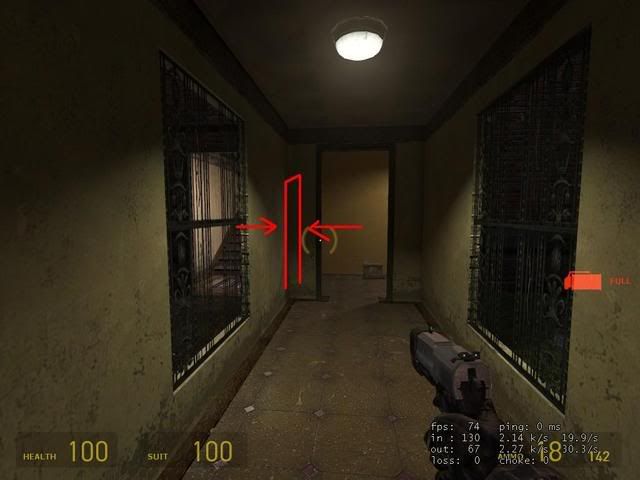
Finally one idea I had which could increase the kill rate on this map is a doorway between the two corridors in the picture below:

Image

Other than that, just to repeat, visuals are superb on this map :D

Jelly Fox

2009-02-28 21:09:48

Cool map, agree on it being too dark and narrow. also remove all the slams, they ruin it.

you might wanna clip the little walkway to the xbow, it's too narrow.

Shoobie

2009-02-28 21:57:27

I really like the look of it, it's sex looking. I would suggest using a bit more of prop_static or not movable physics in the villa. There's nothing more nnoying than getting this chinafood shit in your gravitygun instead of taht nade taht blew you up.

klyemar

2009-02-28 22:29:37

Perfect! This was the kind of feedback I was hoping for, very specific.

I'm going to fix the lightmaps, I was hoping they wouldn't be too much of a burden but you're probably right. I downloaded the .bsp you uploaded Popper but I'm going to have to wait until tonight to give it a look through.

I've had a few people mention the brightness of it, I think I must have my brightness set way high. I'm going to run through with my brightness lowered to see if that makes those dark spots more evident. I think in the future I'm going to just compile it in ldr as well to boost performance. I love the pretty graphics, but it's probably not doing people any favors.

Another thing that I'm thinking about adding is a wide open room where the big doors in the courtyard are. It will be a storage room or something of the sort and will extend to the lower level hallway as well. It might be hard to explain but it's pretty much going to be three stories tall, this room, and it will connect to the roof and the basement as well. I don't know exactly how it's going to look just yet but I think having another wide-open space will be a good thing. I think expanding the backyard would be an improvement as well. I want to make it bigger and add some interesting cover.

klyemar

2009-02-28 22:31:58

Ah, and it looks like Pig Popper uploaded the map to his server at 217.163.30.215:27015, I'm going to try to join up tonight at some point. Hope to see you guys there!

[FF]FNDR.Jake_Brake

2009-03-01 07:10:29

Holy Carp!! Now this map looks beautiful and I agree with whoever said it looks a little like dm_balcony, one of the finest maps ever made! I am not sure where you have been hiding but keep the maps coming! I will play test this with 14 on my server this week for sure!

cyboy bunny

2009-03-01 16:07:59

We play tested youre map yesterday on our server with a few players. And i/we must say its a very nice looking map. We have some points to mentioned , some are allready said but i shall give all the points we have.

-To low fps on many parts off the map. i have a gforce 6600 (256mb) and at some parts it dropped to 15/20 fps. Even the guy with the newest card had to low fps on most parts of map.
-The 2 pieces off rock on/through the roof does not fit in the map. Its looking strange how and where they are now. Replace the rock with a chimny or something.
-In one off the cornes on the roof youre displacement does not fit against the wall next to it. Theres comming light from the back off youre rock now.
-More open space in the villa. Its a bit narrow and only hallways in the villa.
-Less smaller objects/ phycics in the villa . To much rubble now.
-less slams. Its gonne be a slam party in the villa.
- Mayby the skybox ceiling a bit higher. You can bounce frags on the ceiling to the other side off villa when you are on the roof.
-More our personel point is that the appartment models in the 3d skybox looks out placed in those mountains. it does not fit the feeling you get in that mountain villa. Mayby just some trees/fog in there.
in a other post off hl2dmu member screenshots will be placed.


Overall its very good done.alot off good reactions off the players who where ingame.


good luck :wink:

Jelly Fox

2009-03-01 17:40:02

The clipping of the map roof/skybox/whatever needs to be player clipped not physics clipped so you can throw barrels up without killing yourself. :idea:

Ghostface Killah

2009-03-01 19:04:33

its an awsome looking map very detailed and sexy looking idea i was amazed by your work altough i got some issues :)

1. the slams are a bit over done i think a little to much people will get irratated by it. i like the idea but just leave 1 in and make sure to put it down stairs to move them around the map to get them.

2. some brushes are not connecting each other and looks weird its possible that you crash in heavy combat if you look at it. the game can be a pain in the ass i have a screenshot so you can see it. behind the tree

http://img19.imageshack.us/my.php?image ... ta0001.jpg

3. that rock on the roof isnt realy nice there for 2 reasons i guess its a prop static if you touch it some times you bounce away realy annoying. i think like bunny said a chimney or somthing would be awsome :)

4. some places fps drops bad in the suit charger balcony at the smg nades dunno it just feels wierd. i only played the 17mb version maybe the 8 is mb is better :) but i dunnno what it is

other than that its sexy looking and awsome you let us test it :)

{EE}chEmicalbuRn

2009-03-01 19:28:54

yup the FPS issue, i had that too. on well built maps i get atleast 300, i think i was getting about 200 on yours but it dropped way down to 30 in some spots.

i would take the slams out. get one player who's a dick and setting up slams everywhere and that match is done.
make the ladders the fast ladders. map is way too small for that many slow ladders. if somebody is on the roof with rpg/xbow/mag he can see just about all the ladders..........players will be getting very pissed at that.

i liked the map concept, i honestly just thought it was very small.

klyemar

2009-03-01 21:20:21

{EE}chEmicalBurn wrote:make the ladders the fast ladders. map is way too small for that many slow ladders. if somebody is on the roof with rpg/xbow/mag he can see just about all the ladders..........players will be getting very pissed at that.
By fast ladder do you mean the ladder brush?

I'm officially back to work as of now, just working on a lot of the clipping issues right now, but because of all of the terrifically detailed feedback you all have been taking the time to give me I have a feeling that the third version will be drastically better in overall feel, look, and performance. I was playing a guy last night on a server in Germany and I was even having massive fps issues, so I'm going to put an added emphasis on performance in the next version.

{EE}chEmicalbuRn

2009-03-01 21:39:58

klyemar wrote:
{EE}chEmicalBurn wrote:make the ladders the fast ladders. map is way too small for that many slow ladders. if somebody is on the roof with rpg/xbow/mag he can see just about all the ladders..........players will be getting very pissed at that.
By fast ladder do you mean the ladder brush?

I'm officially back to work as of now, just working on a lot of the clipping issues right now, but because of all of the terrifically detailed feedback you all have been taking the time to give me I have a feeling that the third version will be drastically better in overall feel, look, and performance. I was playing a guy last night on a server in Germany and I was even having massive fps issues, so I'm going to put an added emphasis on performance in the next version.
i guess, idk what they are called? valar, help. the ladders that let you move up them almost instantly. i think with a few things taken care of that will be a really good map tho

Jelly Fox

2009-03-01 21:49:22

turbo ladders are here:

http://www.hl2dm-university.com/forum/p ... f=5&t=3348
[EYE] Valar wrote:DOWNLOAD VAL'S IO ARSENAL
download and unpack. this is a VMF.
some here are others, some are mine.

if you need any help with tweaking, understanding wth is going here shout me.

hey! ENJOY!!!
val

boshed

2009-03-01 23:03:31

{EE}chEmicalBurn wrote:i guess, idk what they are called? valar, help.
"valadders" :D

[MB]Brunt

2009-03-02 01:11:49

boshed wrote:
{EE}chEmicalBurn wrote:i guess, idk what they are called? valar, help.
"valadders" :D
roflmao

klyemar

2009-03-02 03:55:09

I just ran through dm_balcony and I was very impressed with it. That's the kind of quality I would like to shoot for after a couple more versions.

Sacrifist

2009-03-02 05:20:07

{EE}chEmicalBurn wrote:
klyemar wrote:
{EE}chEmicalBurn wrote:make the ladders the fast ladders. map is way too small for that many slow ladders. if somebody is on the roof with rpg/xbow/mag he can see just about all the ladders..........players will be getting very pissed at that.
By fast ladder do you mean the ladder brush?

I'm officially back to work as of now, just working on a lot of the clipping issues right now, but because of all of the terrifically detailed feedback you all have been taking the time to give me I have a feeling that the third version will be drastically better in overall feel, look, and performance. I was playing a guy last night on a server in Germany and I was even having massive fps issues, so I'm going to put an added emphasis on performance in the next version.
i guess, idk what they are called? valar, help. the ladders that let you move up them almost instantly. i think with a few things taken care of that will be a really good map tho
Im guessing they are just ladders made from brushes at a particular angle that causes the player to move up them quickly. I had to use them in cp_warpath and avanti for tf2 because tf2 doesnt have ladders. They dont do any good towards how a player looks going up them, but they get the job done in a tight spot where a ramp is impossible. Valve really should of went with the CSS approach towards ladders in hl2dm.

Pig Popper

2009-03-03 03:04:01

klyemar wrote:I just ran through dm_balcony and I was very impressed with it. That's the kind of quality I would like to shoot for after a couple more versions.
yea sweet map, he makes texturing look like its easy :D

klyemar

2009-03-10 01:58:22

Well I've been knee deep in the muck for close to a week now and I've made some progress, at the expense of some blood, sweat and tears. I wanted to make an update, not only to mention what I plan on adding to the map, but I wanted to open myself up to any suggestions that anyone here might have. I don't have any competitive DM experience, just casual, which is made apparent by the cramped quarters of this map. That's why I'm overhauling three main portions of the map.
I'm making the back yard wrap around the corner of the building, and now the yard will connect to the main entrance and front gate which is under construction right now. This frontal area will effectively triple the size of the back yard and add some realism to the map.
I'm also planning on expanding the caves below the map and the area connecting to the man-made tunnel connecting the stairwells. If it works well, I'll have a large room accessible via the large double doors in the courtyard, that will connect to a similarly large storage room below. If it works properly, I will be able to add much more area that will be easily accessible.

Enough rambling; I want to know if there's anything that more experienced DM players would like to see added to the map. What do most of you find fun in a "fun" map? What do you find frustrating in a map that can be easily avoided? I know I'm asking a lot, but I feel like first and foremost, this is a very collaborative process and more than anything I want to make something that I'm proud of that you would all have a blast playing as well. If you're able to take some time out to help, I would be most appreciative! :mrgreen:

Soon I'll have some pics to post, once I fix the huge gaping hole in one half of my map. :wink:

Shoobie

2009-03-11 19:21:16

Add me: Tomsalt

{EE}chEmicalbuRn

2009-03-11 20:00:42

well, most(if not all of us) know how to bhop really well and we like to be able to do that to move around a map quickly. if i recall correctly this map didnt give much space for this. you can pretty much remove all slams, in competition play nobody uses them. especially in a close quartered map like this. if any of us join there during a pub match and ppl are laying slams all over the place, making it even more impossible to move quickly thru the map, 98% of us are going to just leave. make the rpg accessable but not so easy to get that its whored, and dont place it in a spot that is the center control point on a small map such as this. that will make it very easy for a good player to just camp there killing everybody with the rpg and not even have to move to reload it. also on a small map like this you might want to limit the spam pick ups, that will hurt play aswell.

thats all i can think of ATM. "what makes a map fun"? ask Valar, he will tell you that you never know which maps will be successful and which wont. plus from the get go of the map design you really need to decide which crowd you are catering to......pub style, KB, low grav, CAL, 1v1-----4v4? as almost every mapper will tell you its pretty much an impossible task to cater to all of them, just doesnt work.

good luck with your map bro

reaper47

2009-03-11 20:40:02

Don't know if I got the latest beta, but I had a look and this is what I noticed:

- These parts are too dark and need an additional light:
Image
Image
Image
Image
Image

- This dead end will probably turn out to be annoying:
Image

- You got some unnecessary, narrow 180° U-turns that require too much turning around. You should shorten those and maybe turn them into wider 90° corners instead:
Image

- People will try to climb the ladder from this (wrong) side:
Image
How about turning the postion of the ladder by 90° (clockwise)?

- Super-unimportant eye-candy issue: You can change the x-alignment of each stair's texture to make the pattern less repetitive:
Image

The map is generally a little narrow and dark. But nice layout overall!

[FF]FNDR.Jake_Brake

2009-04-14 05:45:38

Playtested this map with about 8 players the other day, and the only real complaint was that when any barrel explosion occurred, it literally brought the performance for all players to it's knees. This in itself, makes this map unplayable for public servers unfortunately.

Outside of that, this map absolutely rocks! Great job and I will be keeping my eye out for the next release! :)

[FF]Assn.Juim

2009-04-14 22:11:07

I have to agree with Jake_brake. The problem could have been server side, butit does'nt happen in any other maps that I know of, and I can't think of a cause, but barrel explosions really lagged up the server. My only other suggestions would be to maybe expand the mid(ground)level outward in at least two directions. The map has a cramped feel to it. As far as quality of construction and build, it's really very nicely done. I admire your attention to detail, and for a first release, this one definitely stands out.