KommanderK, this map cannot be optimized. had a good look through it.
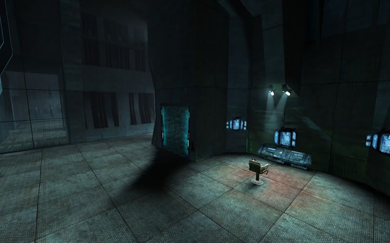
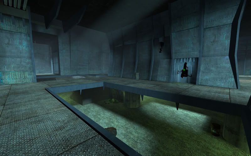
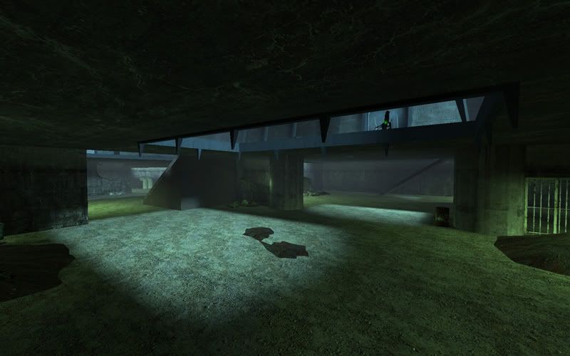
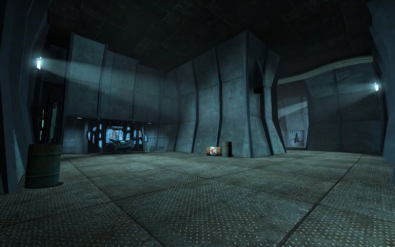
reason being you see everything from everywhere. the only way for you to move on will be to go back to hammer and start adding world geometry that will block vis.
the idea behind adding geometry is to completely block visibility of areas. run your map and do sv_cheats 1 then mat_leafvis 1. visleaves will be shown by a red lining. see how your map is cut to leaves and then maybe take screenshots of the different areas.
go back now to Hammer and look at how this arrays in hammer. what you need to mind is how to put "blockers" so you can' draw a line from one leaf to the other.
and in particular - you decide that this or that area will be area #1 for example. now, see how to block vis to all other areas around it. you'll see that major modifications to your map will be required as now it's literally wide opened. it's going back to the "drawing board" sort of speak.
Something else you might want to try would be applying fade distance values to all your props and items (physics as well as static). naturally different props will require diff settings.
A common setting for weapons / ammo / phys props would be min 1200 max 1500/1700.
static props is again, depending on the layout, their purpose and how far you actually need them to be visible. play with values. fun thing about the fade dist is you can use the circles in your 2d view to pull then in or out according to your map's layout.
Word about props - the more complicated the model is and whether or not it has moving parts the more expensive it will be to render. and naturally, the more of those rich models you have in one area the lower your frames will be - e.g. your combine upper level areas...as Sadist wrote. fade distance is your biggest friend here.
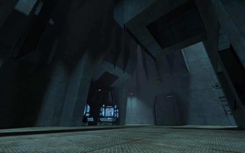
Another thing i'm not a big fan of is too dark maps. you don't REALLY need to flud lights to light up a map. you can use more spots (and point_spotlights with them). find more reasons to light up a corner or middle section of a long wall. see even if you're left with darker patches in the center but all around it you see lit spots you're still giving the player something to work with. note that a lot of people will hardly see anything in your map being so dark, be it their hardware / other restriction or their personal preferences / brightness / gamma settings. so i would look at that personally.
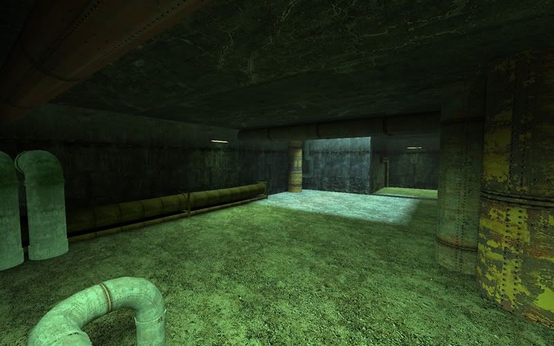
Other than that, your brushwork and detailing are GREAT!!! You sure know how to mind details and create atmosphere so in that respect that map is VERY good. It feels very much like a single player level and that's a great compliment!!!
hope my optimization tips made sense

, let me know if they didn't.
val
