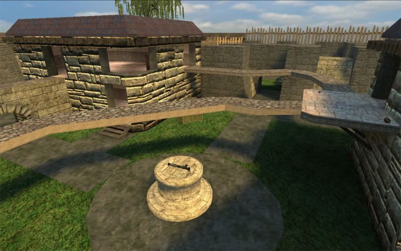
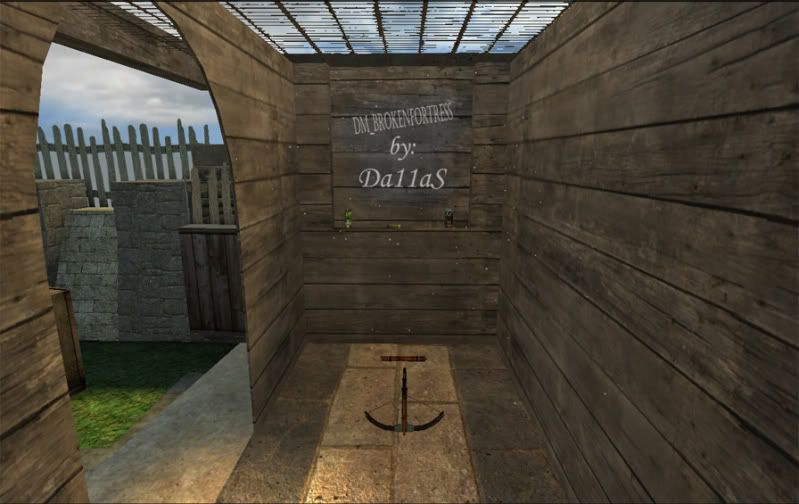
dm_brokenfortress_r1 -- CONTEST ENTRY

Da1

2009-04-15 07:23:34

Hey everyone. Here is the long awaited DM_BROKENFORTRESS.

I have always been a fan of the lostvillage type atomosphere so before you just look at the screens don't judge it without playing it!!
The map took me about a month to make, with breaks in between, for overall span of about 3 months.
Any comments are welcome good and bad; I would like to know what all the judges thought of my map and what its bigest downfall was for not making the top 3. Thanks WT for putting on the contest, it produced alot of great maps and I am happy that I could take part in it!

Screenz:
Image

Image

Image

Image

Image

Image

Image

Image

Download Here: http://files.filefront.com/dm+brokenfor ... einfo.html --- Kinda large due to all of the custom content (40 megs zipped!!)


Thanks - Da1

[EYE] Valar

2009-04-15 07:27:28

FIRST!!!!!!!

LVOE IT. AWESOMENESS. GREAT WORK.
:D

badinfluence

2009-04-15 07:48:40

Da1 wrote: Any comments are welcome good and bad; I would like to know what all the judges thought of my map and what its bigest downfall was for not making the top 3. Thanks WT for putting on the contest, it produced alot of great maps and I am happy that I could take part in it!


Thanks - Da1
I know we've had beef or whatever, but I don't think you had a "biggest downfall." The map is very well put together. I only had two problems with it. The lostvillage type theme and how the items seemed grouped together. Otherwise, the map is great. The other ones were just better... : /

Sacrifist

2009-04-15 08:20:41

did you remove the dl link?

Da1

2009-04-15 08:33:46

Yea, some of the files weren't paked correctly, fixed now!

{EE}chEmicalbuRn

2009-04-15 18:17:12

this map actually was in MY top 3. the only thing that put you behind my top 2 maps was that the other 2 were "fresh and new" something i hadnt seen before, so i had to give them some credit for that. but yours was very close. i mean, its a great map, no doubt there, just based on something i had seen so much of in the past.

Paradox

2009-04-15 20:07:37

I have to agree with the previous two posts. The map is technically sound but it really has already been done with lost village and lost_village_two (the original one you did, not the final), which IMO is a better map and has better textures.

I guess I felt that a seasoned mapper such as yourself should have been able to come up with something a bit more original.

Sacrifist

2009-04-15 20:12:40

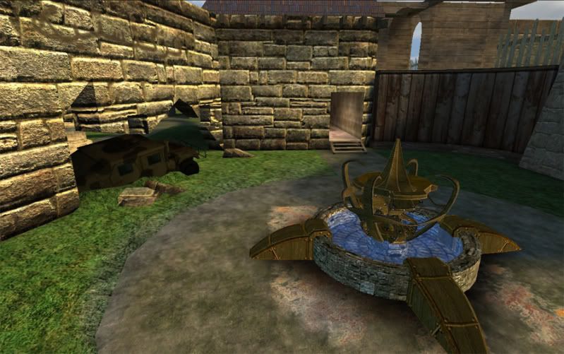
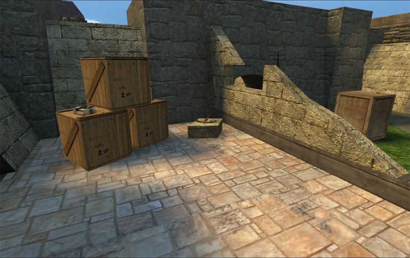
This map needs alot of work. I hope you continue to work on it. Things I noticed after a 10 minute runthrough were just little things really. Textures not lining up, brushs that stuck out a bit further then they should (or not as far) and also you have some models that are not flush to the ground. The one that is some type of water fountain isnt flush to the ground, nor is at least one of the larger crates. The layout is nice, but there are alot of little things that need fixed up. I would have a hard time putting this map in my rotation because of it's size. It would have to be perfect for me to do so and as of now, its not. If you need me to give you screenshots of everything I noticed, just holler.

I also agree with para, you really should of went with a different theme. You and Valar have ran the lost village look into the ground lol. There was a time when I wanted to see more maps with the LV look, now I hope to never see another one again haha.

[EYE] Valar

2009-04-15 21:11:43

how exactly have I ran the LV look into the ground?
i'm sure you can explain.

Walking Target

2009-04-15 21:24:36

Great map, ranked high on my score card. I don't really have anything bad to say about it.
You were very close to the top score on my score sheet. Probably only the fact that it was a flat style map put it just slightly behind the leaders, but only by a few points. My top map had more vertical play to it, and played slightly faster 1v1.

thrash

2009-04-15 21:41:43

Just had a run around it and I like it a lot.
There were a few small things which if changed I think could make the map a little smoother.

The back of this ladder could do to be playerclipped as I got caught on it a few times when bunnyhopping through the map.
Screen: http://i44.tinypic.com/wulz6p.jpg

These wooden planks could do to be a bit higher so you can bunnyhop through or jump from that window ledge without having to run down to the exposed bit next to it.
Screen: http://i41.tinypic.com/ff2xd1.jpg

This path looked a bit messy to me and would look a lot nicer if the corners were made using the arch tool rather than just cutting the brushes.
Screen: http://i40.tinypic.com/x6kidc.jpg

This broken wall could do to be either higher at the end so you can jump through or lower so it doesn't look like you can jump through because I got stuck there a couple of times too.
Screen: http://i44.tinypic.com/2lucqax.jpg

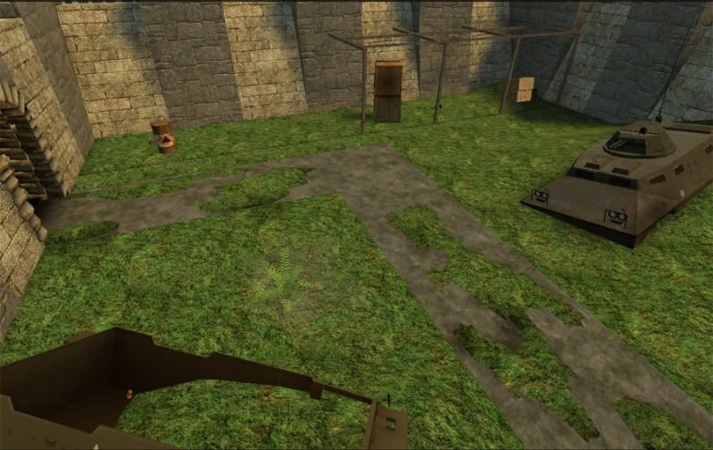
Also the truck near the tank would be better playerclipped so that you can jump over it without getting caught.
I liked the layout a lot and the RPG area in particular although I think the main issue layout wise is the connectivity of the upper levels isn't great and I think with a few small links it could be improved.

Sacrifist

2009-04-16 00:04:53

[EYE] Valar wrote:how exactly have I ran the LV look into the ground?
i'm sure you can explain.
Yes I sure can explain.
Here are maps that I consider to have Lost Village inspired textures. dm_is_alive, dm_milieu, dm_warlock, dm_mudafuga, dm_losthope and dm_ftw has a section that has similar Lost Village textures. Now, the only one that is questionable in that list is losthope, which has a more desert like theme, but it still looks similar. Now, there is also, dm_lostvillage_r1, dm_lostvillage_two, dm_lostvillage_v2 and now dm_brokenfortress_r1. Most of these have been made within the last year or so. There is nothing wrong with any of them either, in fact, milieu is one of my favorite maps, but my point is still valid. When so many of these village themed maps have came out, new ones start to feel repetitive and old, regardless of the layout. The "freshness" is gone.

Paradox

2009-04-16 00:43:19

LOL!! Sacrafist......

I beg to differ bro...

How could Mudafuga be anything like LV? The textures are no where near anything like LV and neither is Milieu. FTW was a map he threw together for the hell of it. Alive and Warlock .....hmm yea there are some brick textures but it doesn't mean they were inspired by LV.

In fact the only map that was "inspired" by LV is losthope and that is more in terms of layout than anything else and IMO a VAST improvement over LV hands down!

Cynips

2009-04-16 01:24:59

I ranked this as my no. 4 with minimum possible margin (both my no's 2 and 3 had the same score). Yours could've gotten slightly higher grades for novelty and more coherent (for lack of a better word) visuals. Other than that, a really great map!

What I think people refer to as LV isn't so much textures as an outdoor map with some interconnected buildings with (mostly) two levels of play.

[EYE] Valar

2009-04-16 02:56:20

Maps with interconnections are what one would call Good Maps. not LV inspired.
If we had to rank all interconnected maps in your LV category we would have to find a way to fit in LD, zeta, lostarena, caverns and the list just goes on and on.
Simply put, Sacrifist, this is one weird post sir. i have no idea what purpose it served. it sure wasn't logic or truth.
And even if you do in some strange way actually believe it to be either logical or true or both, i'm not sure this comment about da1's and my maps was the most kind or supportive one.


val

Sacrifist

2009-04-16 03:34:48

[EYE] Valar wrote:Maps with interconnections are what one would call Good Maps. not LV inspired.
If we had to rank all interconnected maps in your LV category we would have to find a way to fit in LD, zeta, lostarena, caverns and the list just goes on and on.
Simply put, Sacrifist, this is one weird post sir. i have no idea what purpose it served. it sure wasn't logic or truth.
val
It's very logical. You asked me why, I told you why. Sure, not all those maps look just like LV or have the exact same LV texture set, but the textures, to me, are extremely similar. And if it's not the textures, it is something else. To me, the whole tan/de_dust/LV/PVK II look is just getting old now. It's just an opinion.
[EYE] Valar wrote:And even if you do in some strange way actually believe it to be either logical or true or both, i'm not sure this comment about da1's and my maps was the most kind or supportive one.
Im not posting in the mapping section to boost egos, I generally post here to make mappers make better maps. I would expect nothing less then that from anyone else. Saying "Woohoo!, thats awesome!" on a map that has alot of small things wrong with it doesn't help Dallas at all.

What I said about the theme has to do with how I felt running around the map and it is 100% OPINION. I didnt feel inspired. I guess I was wanting more, thats all. dm_fraggingyard (aka dm_armegeddon) and lost_village_two are really nice and I was expecting to be blown away this time.
[EYE] Valar

2009-04-16 04:06:58

So the textures aren't exactly the same but they're the same to you. :D AND it's VERY logical. :lol:
The maps you've mentioned have absolutely not one texture in common with Lost Village, not one design line or even thought following Lost Village. You cannot "see" or even "imagine" Lost Village looking at them not even using psychedelics, seriously, this is quite clearly a gob of nonsense if not a bad joke. I won't even bother posting screenshots showing the non-comparison.
As para wrote, the only map i made that was inspired by Lost Village was Lost Hope and i actually posted about it out right from the start. needless to mention, the end result hardly resembles Lost Village. Here again, you will need to be in REM to find similarities.
True, if you want to help someone make better maps you don't have to boost their egos but you don't necessarily need to bring their egos down. If people can't take criticism that's their problem but what you did is called Trashing which has more to do with Bitterness than with a Desire to do Good :wink:
Fortunately enough, i know exactly what my maps look like and what they were inspired by and what's more important: how to select good from bad criticism. i hope my friend da1 does too.

best.

[FF]FNDR.Jake_Brake

2009-04-16 05:20:51

Well my friend, I am sure I will like this map just as much as all of your other releases. I'll download it and give her a run when I get home this weekend! Once again, thanks for your continued contribution to the HL mapping community!

Sacrifist

2009-04-16 05:28:33

[EYE] Valar wrote:So the textures aren't exactly the same but they're the same to you. :D AND it's VERY logical. :lol:
The maps you've mentioned have absolutely not one texture in common with Lost Village, not one design line or even thought following Lost Village. You cannot "see" or even "imagine" Lost Village looking at them not even using psychedelics, seriously, this is quite clearly a gob of nonsense if not a bad joke. I won't even bother posting screenshots showing the non-comparison.
You have taken a simple opinion of mine and turned it into something a little more personal here. So I guess Ill treat this as hostile.

Those maps I mentioned all look similar. If I took any of those maps and asked someone that played the game 3 years ago and hasnt been around since, what map he thought they looked like, it would be LV. You obviously seem to care for some reason about the fact that I think this look is getting boring, not sure why, but whatever. As I said, that is my opinion.
[EYE] Valar wrote: True, if you want to help someone make better maps you don't have to boost their egos but you don't necessarily need to bring their egos down. If people can't take criticism that's their problem but what you did is called Trashing which has more to do with Bitterness than with a Desire to do Good :wink:
Fortunately enough, i know exactly what my maps look like and what they were inspired by and what's more important: how to select good from bad criticism. i hope my friend da1 does too.
best.
LOL ok. Hopefully Dallas isnt crying in the corner from my so called trashing. Im glad I avoided posting my thoughts on a few of your maps. From the way you handle my criticism and opinions, you might of committed suicide. You need to stop taking an opinion so seriously. You will never get better at mapping if you bitch and moan about every criticism made to your maps. You think Im trashing? Im being gentle. Post your maps on some real mapping community sites and see how it goes. :wink:

Paradox

2009-04-16 06:21:41

http://www.fpsbanana.com/maps/27903

http://www.fpsbanana.com/maps/49333

http://www.fpsbanana.com/maps/49334

http://www.fpsbanana.com/maps/49335

http://www.fpsbanana.com/maps/64309

Admittedly this isnt a very big percentage of his maps considering how many he has done, but also look around. It is hard to find any pub that does not have at least one of Valars maps. If they were crap, they would not be run. I will also add that in developing maps, Valar has consulted with MANY people in the community on many of his maps. He has taken many of the opinions expressed to him and did something with them. The problem with opinions is, like buttholes, everyone has one and often it is difficult to reconcile the differences you inevitably hear.

ninojman

2009-04-16 06:22:46

I ranked it high on my cards, I thought it was at least the best current version of Lostvillage. I question the flow as I haven't played a large game on it. But with the RPG in the center and about 10 angles to come from it would be a bitch to hold and would provide some interesting game play.

I think with new models and textures it would have done a lot better. Since when you first load the map you instantly notice the Humvee from Lostvillage_two, then the fountain, and the trees. Then the tank.

Sacrifist

2009-04-16 06:45:14

Paradox wrote:http://www.fpsbanana.com/maps/27903

http://www.fpsbanana.com/maps/49333

http://www.fpsbanana.com/maps/49334

http://www.fpsbanana.com/maps/49335

http://www.fpsbanana.com/maps/64309

Admittedly this isnt a very big percentage of his maps considering how many he has done, but also look around. It is hard to find any pub that does not have at least one of Valars maps. If they were crap, they would not be run. I will also add that in developing maps, Valar has consulted with MANY people in the community on many of his maps. He has taken many of the opinions expressed to him and did something with them. The problem with opinions is, like buttholes, everyone has one and often it is difficult to reconcile the differences you inevitably hear.
When did I say that every one of his maps looked the same? Or when did I say that I didnt like any of the maps I listed? Yup, thats right, I didnt. I said they (being the ones I listed) all looked similar, due to the textures that were used. Which comes to my point about ME getting tired of maps that have a lost village look and feel to them. The bottom line is, everytime I make any comment on Valar's maps (or posts :?), he gets all defensive. I never put him or his maps down. I said the look is getting overdone. He takes it as some evil post from hell and starts making comments about me somehow being insane for thinking that way. Pretty retarded if you ask me.

Da1

2009-04-16 07:30:01

Thanks for all the comments guys, in between the valar and sac arguments -.-

I will review the input and have another release out within a week or so.

Paradox

2009-04-16 07:53:07

Yea Dallas, Sorry about that. This was supposed to be a thread about your map, not a debate about people's opinions on what maps are like LV and what are not.

keefy

2009-04-16 09:42:12

Looks good.

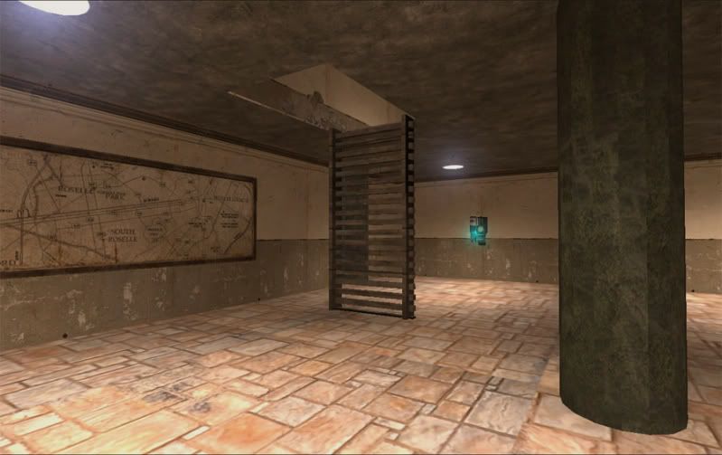
Radiators look a little ou of place perhaps.


Can get caught on these wall due to the different angles it occurs through out the map. Simple clipping thingy.
Image

Dark area for some reason?
Image

Same spot but this hump is a little high and can hinder a player. It stops me dead when walkin in the direction i am facing.
Image

Pig Popper

2009-04-17 03:51:48

72mb for a map is biiiiiiiiiiiiig, plus that grass texture Oo.... stock textures ftw bud :lol:
Personally id pick 2 or 3 customs and work around them, dm'ers can be a delicate bunch and sticking around to download new maps is like dm poison to em..

found a few textural issues but i'm assuming you was working to a deadline :wink: I can take some pics if you need em.

Da1

2009-04-17 04:36:07

[22g]Pig Popper wrote:72mb for a map is biiiiiiiiiiiiig, plus that grass texture Oo.... stock textures ftw bud :lol:
Personally id pick 2 or 3 customs and work around them, dm'ers can be a delicate bunch and sticking around to download new maps is like dm poison to em..

found a few textural issues but i'm assuming you was working to a deadline :wink: I can take some pics if you need em.
LoL, yea I made the map more for eye candy than anything, next time I will definently take that in to consideration, I thought hmm if people like how it looks they would vote it. And ya, there are a few texture issues, working them out now.

[EYE] Valar

2009-04-17 05:58:07

lol popper then you should wait for castle :D .
i don't think its that big of an issue really mate.
i'm more looking into how it plays (very well) and if there are any issues / bugs (those are being sorted). other than that, having DLd Misheps castle i can't really say big maps frighten me anymore lol.

haymaker

2009-04-17 06:28:29

I'm scratchin my head on the filesize, there's plenty of stuff here that could be from the hl2 gcf like Popper said, I'm not sure. On top of that I run all setings low on default, and
it looks as if a) they are 512x textures scaled up to .40 or b) they're 256x. So that is my
impression withour bumpmapping etc.

You've made this much more unique than just an LV clone. It's so happy!:P I kept feeling
that my FOV had changed somehow, it feels "wide", not in a bad way, just visually.

I see a bit of LV in here. I was driving around today and noticed a lot of grass/ stone wall combinations throughout the city, it wasn't hard to make the "LV connection". Layout reminds me more of Rigormortis without the roof access.

My comments are just aesthetics, quite a few spots could be tweaked without losing frames
etc. I noticed a few misaligned textures, odd design choices and strange brushworks as noted
above. The one that sticks out is at the supercharger jump, did you leave that 1 unit lip
there on purpose? Also there's a circular wall with no fence behind it, makes me wonder why
I can fall off one side and not the other. One or two lighting anomalies.

I would hazard a guess that this will get pretty frantic despite its apparent size. Awesome map!