dm_jaeger

Sadist

2009-04-16 02:31:11

Hi guys, here is my map, as entered into the hl2dmu mapping competition with a few changes following feedback.

dm_jaeger_rc4 - Download Here

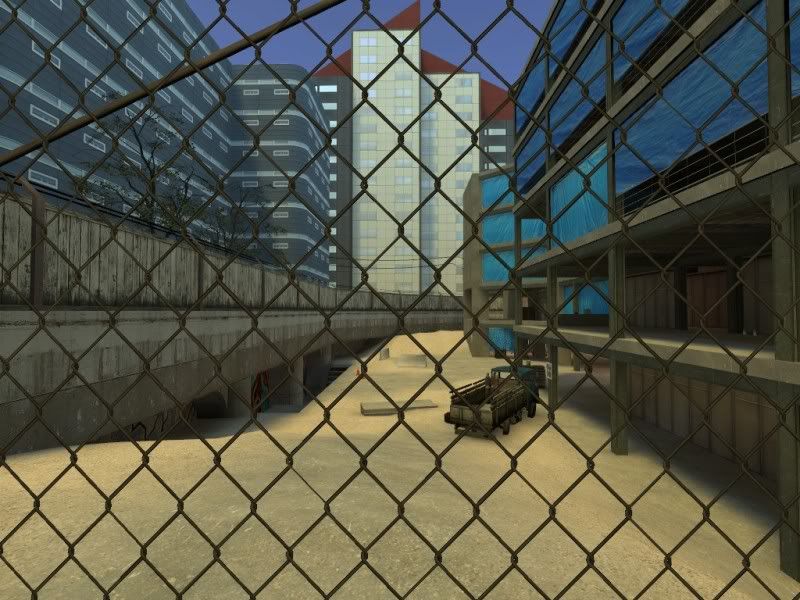
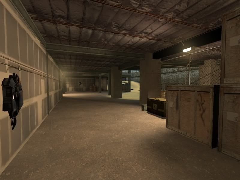
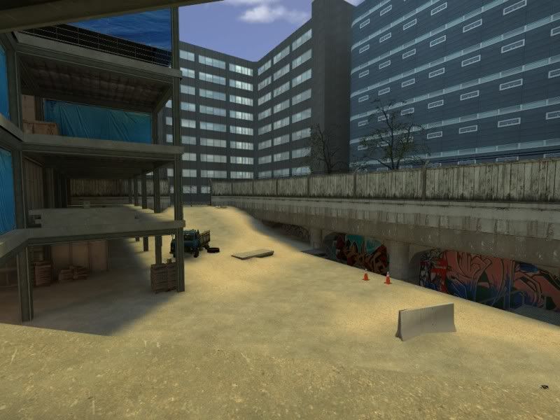
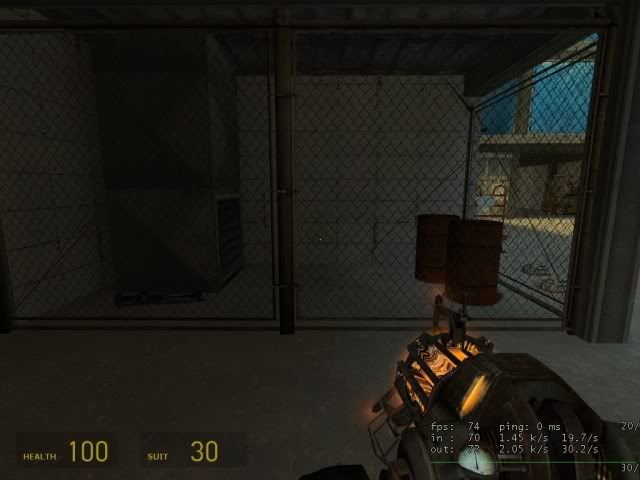
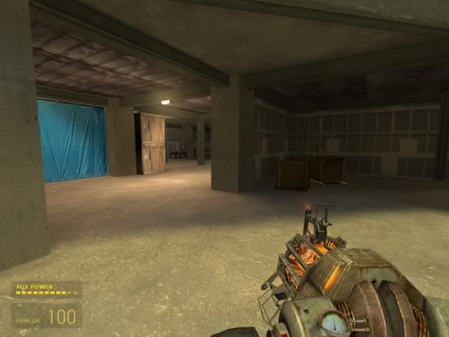
It's a map based on a construction yard, the building is half-way through completion. It's a medium sized map, and while there are separate parts of the map, these blend into eachother - there is only one enclosed space in the map (the basement).

I spent alot of time assembling and editing photos for the building textures, as I wanted to create a level of realism. The buildings were based on the city of leeds in england:

Image
Image
Image

I also got to use alpha blend textures for the first time, so I could blend areas of concrete floors with sandy areas without having to use two brushes.
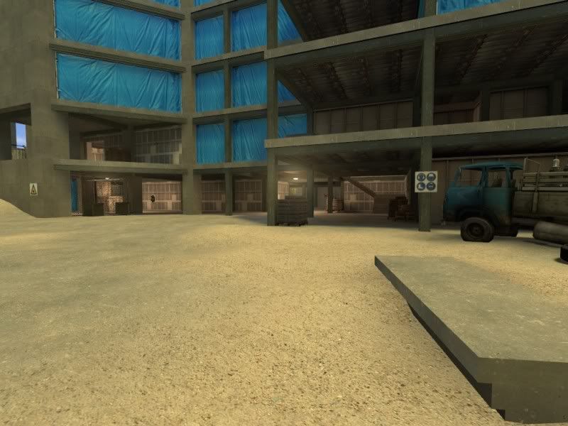
Image

There have been 3 changes, added a staircase to cover 3 floors of the map, opening up the central part of the map:
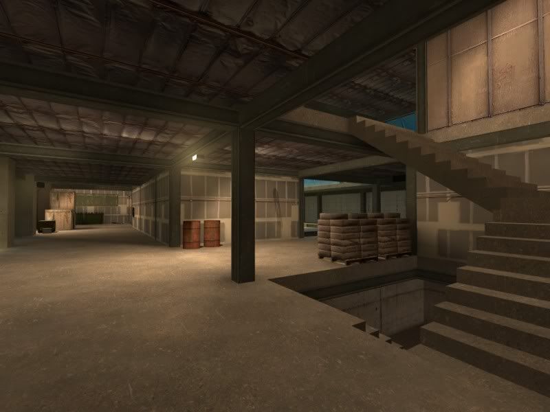
Image

A new passage on the right side of the screen below (Previously a dead end).
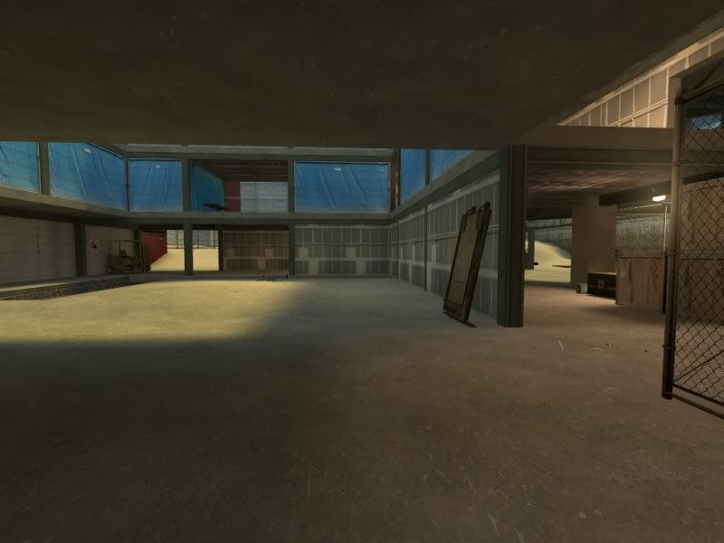
Image
Image

Heightened cubemaps featured in this map, allowing reflections to be seen in high detail on the building windows:
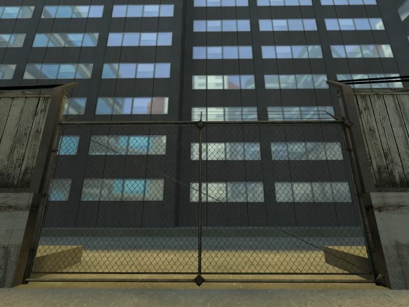
Image

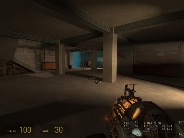
Also increased lightmaps were used in the basement area to increase detail on shadows with bright lights:
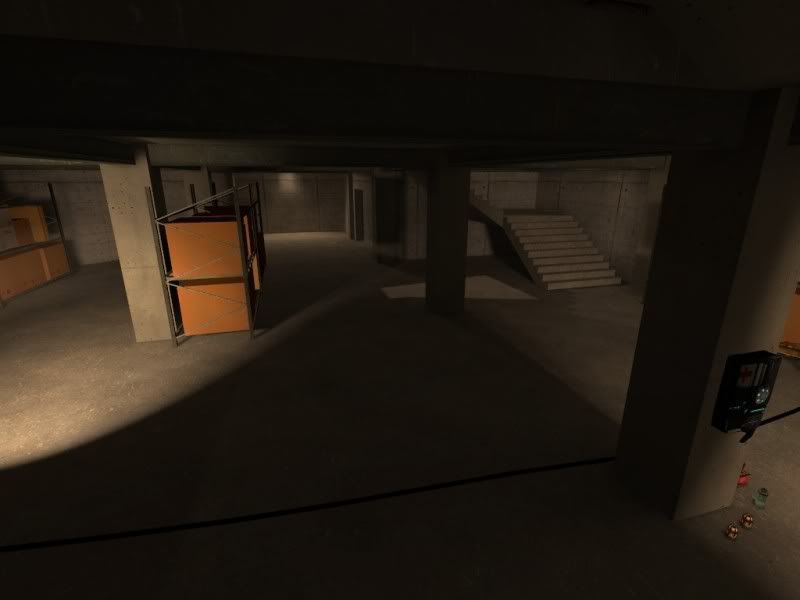
Image

Whilst building the surrounding map I noticed some resemblance to a place of some significance in the town of nottingham (insert robin hood reference here).

Image
Image

Nottingham victoria station, now demolished and in place a shopping centre, was built in an excavated space, so I decided I would try to give the impression by creating some arches that my construction took place within a former rail station.
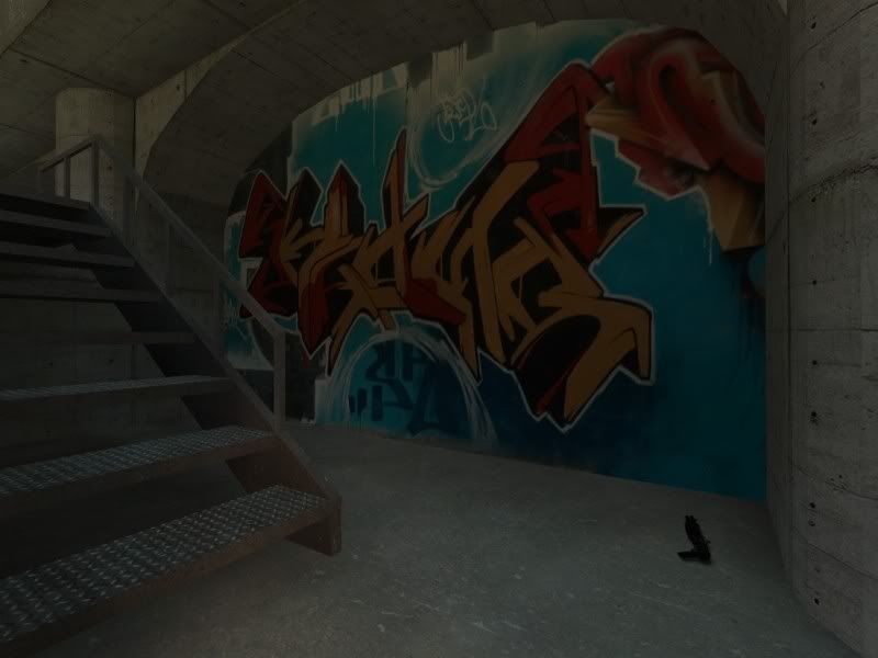
Image

The third change was an addition of a break-out space for the builders, in the form of a porter cabin. Thanks to gtamike for this suggestion.
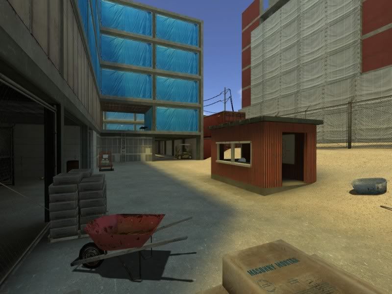
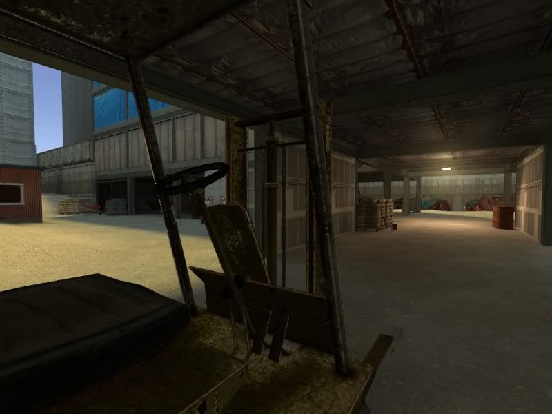
Image
Image

Hope you like!

Image
Image

Walking Target

2009-04-16 02:44:06

ooo can't wait to check out this revision Sadist. Thanks for posting it here.

gtamike_TSGK

2009-04-16 02:49:28

Great map Sadist

+ Good use of sounds really adds the atmosphere
+ The map has a nice layout and I think it will play well on a full server
+ Good use of textures
+ The lighting is just right
+ Frame rate was fine for me

Nice work on the updates good improvement. 8)

[EYE] Valar

2009-04-16 03:06:16

DLing now.
floored at screenies.


edit: played through it. perfect brushwork. perfect design. perfect props and textures. /me bows low.

Paradox

2009-04-16 04:03:31

Wow nice way to incorporate something from real life into a map.

I liked this map and I look forward to checking out this revision.

[FF]FNDR.Jake_Brake

2009-04-16 05:23:44

Wow! Yep, love the screenies! I don;t think I have ever seen the use of blue tarps in a map before? Very unique and creative. I will hopefully playtest this one this weekend! :)

boshed

2009-04-17 02:31:40

This really is a beautiful map.

It looks far too clean for a building site, but it works well in a kind of surreal cartoonish way.

Pig Popper

2009-04-17 03:21:19

lovely map Sadist, (my fav so far) Great use of layout and lighting and high quality mapping as usual. :D

Sacrifist

2009-04-17 05:37:34

boshed wrote:This really is a beautiful map.

It looks far too clean for a building site, but it works well in a kind of surreal cartoonish way.
I agree. Everything looks so neat that the fence along the concrete wall looks way out of place because it's scruffy looking lol. If you made these textures, bravo. They are pretty impressive and I've not seen better textures for a building site like this. I know some of the textures and models in this map are css textures, but you should make a texture pack and release it if alot of these are yours. I know I would use them if the opportunity came. How big of a fps drop did you get when you upped the cubemap detail? I would think having all those reflections would be pretty costly. Overall, I cant complain about much here other then the lack of junk laying around.Personally, I prefer it without all the junk when it comes to actually playing on the map so no real complaints from me. Good job man.

Sadist

2009-04-17 06:16:27

Thanks for the comments and feedback, this is encouraging.

As for the cubemap reflections, I didn't receive a hit for fps. I guess it depends on the graphics card, some users may get a hit. I checked by changing mat_specular 0 - is this correct?

I can release the textures, no problem. They came mostly from cgtextures.com, which I heavily modified to include cubemaps, and some to tile. I'll pack something here soon.

It's clean, which is a habit of my mapping, so apologies for people looking for realism, but I wanted to keep fps high.

I think one self-criticism of this map is it's low potential for tdm. I feel the areas would be difficult to hold, maybe i'll be proved wrong i haven't playtested in tdm.

[EYE] Valar

2009-04-17 06:30:32

Sadist wrote:I think one self-criticism of this map is it's low potential for tdm. I feel the areas would be difficult to hold, maybe i'll be proved wrong i haven't playtested in tdm.
i hear ya. same here. we'll wait and see then :)

Sacrifist

2009-04-17 06:56:06

Sadist wrote: I can release the textures, no problem. They came mostly from cgtextures.com, which I heavily modified to include cubemaps, and some to tile. I'll pack something here soon.
Excellent
Sadist wrote: It's clean, which is a habit of my mapping, so apologies for people looking for realism, but I wanted to keep fps high.
This is also my biggest problem, if you want to call it that. Im to used to mapping for hl2ctf where everything is movement related, so having crap all over the place is really a no go.

haymaker

2009-04-17 07:16:30

Wow this is some really talented work, as expected from you. Has the level of professionalism that will impress new players from other games. First thing i was impressed with was the framerate throughout, nice job on the layout with that factor. Next was the already-noted cleanliness, I've never been on a job site so well-maintained! Not even a drop of glue or scrap of drywall to be found. You're hired ! The lighting is excellent throughout, though I'm not a fan of blinding eye-level sprites. Sound is simple and effective, that tool sound cut out midway it seemed tho. Nice use of a breakable vent too.

Im unsure as to the purpose of that short set of up and down stairs. Seem in the way more than anything. I thought the wall opening above the dumpster pair could be higher to allow the continuation of the jump from above. The outside area seems like a place to avoid rather than go collect and regroup.

Great mapwork, your releases are among the most polished that can be found for this game.

Neolinkster

2009-04-17 07:31:46

haymaker wrote:Im unsure as to the purpose of that short set of up and down stairs.
I think it was for realism I've seen those setups plenty of times b4

koncentrate

2009-04-17 12:17:34

i played that map yesterday and i have to say: WOW! awesome work mate!
only thing is: the blue film isnt destroyable (dunno if this is right english)
but all other things i really liked!

Shoobie

2009-04-17 18:35:18

Sadist wrote:lI think one self-criticism of this map is it's low potential for tdm. I feel the areas would be difficult to hold, maybe i'll be proved wrong i haven't playtested in tdm.
I'd beg to differ here. Though I would suggest a total weaponplacement revision. I agree with you that as it is now it is difficult to hold any area, tbh there's no reason to hold any area. For example, what would make you want to stay at a certain area? Maybe a strong weapon, a lot of health/suit, an advantage point?

To your weapon layout, the ar2 for instance is a powerful tool. Now you have a couple of them out there, which makes it
hard to neglect that resource for the enemy. There's no point camping it when they can get another one buy just avoiding you. Same goes with the health which is quite spread out, you could concentrate it on some points adding more 50 hp places. Maybe some more 30 suit places also. SO people want to go there/have to go there when they are hurt.

With the placement of resources you can control the players, you can control tehm so some areas are worth to use or control the so they have to go there.
haymaker wrote: The outside area seems like a place to avoid rather than go collect and regroup.
I agree in what haymaker says. If you lets say put 50 to 60 hp out there and keep the smaller amount of health packs throughout the house areas you will make people go the the outside for a quick way to get health.

Maybe you put the orb away form the ar2 then you have to get the ar2 and then the balls in order to use its full potential. Plus you get a movement for teh players and you get areas to be used or to be given a higher control value. (I know you done like that, it was just an example)

Now to two items I miss and you might not want but here's my view on it. The RPG and the supercharger.

The charger, a quick way for health and suit. An item worth controlling and using. If you put one of those in one outside area and like 50 to 60 hp in the other you make them worth going to, worth to stay at and control.

The RPG. Yeah I know it's not liked by some but, it's a weapon worth controlling. A weapon worth holding, a weapon worth using. Let's say you put a rpg in the basement. There it's not really good to use, this creates a movement. In the house maybe it's not as good either but on the top floor or on the outside areas it will be dangerous you force people to move. First to the area then from it.

Put a rpg ammo for instance at the top floor where you have a crossbow and you have a nice place to guard the charger if you put one there or guard the health/ ar2 or whatever it might be worth to guard. Now you've greated a "forced" movement form down to top. YOu're controlling the players to move from one place in the map to the opposite.

A map with controllable areas, but worth moving on.

I love your map and I see a lot of potential on it. This is a work of art, 5 thumbs up.

These are just suggestions but more for showing my point of view. I'm sure you can use the examples and think of other ways of achieving the same results if you would like to do it.

thrash

2009-04-17 19:06:23

I agree with everything that Shoobie said, we had a run around on it yesterday on my server and I definitely see TDM potential with weapon placement revisions. I think the main thing is like Shoobie said to have some health outside particularly around the outskirts to encourage people to not just stay in the house where the majority of resources are.

voz

2009-04-17 20:19:33

dang! looks really smooth in the screenies looking forward to playing it ,nice job keep it up.

Sadist

2009-04-17 20:36:41

Ok, so what you're saying here is the weapons cancel eachother out as it is not necessary to hold a position when the e.g. ar2 is in 2 places. Also healthkits in the main grounds. I'll consider revising this soon, don't have much time this week but i'll do an rc2 sometime soon and consider the feedback.

Thanks.

Sadist

2009-05-07 23:39:08

Hi guys, I've updated to the map with a total items overhaul, and a couple
of brush changes.

The item list as it stands now (feedback please, this is not final version)

item_ammo_357 x 1
item_ammo_ar2 x 2
item_ammo_ar2_altfire x 3
item_ammo_crossbow x 2
item_ammo_pistol x 2
item_ammo_smg1 x 2
item_ammo_smg1_grenade x 4
item_battery x 6
item_box_buckshot x 3
item_healthcharger x 2
item_healthkit x 6
item_suitcharger x 1

weapon_357 x 2
weapon_ar2 x 2
weapon_crossbow x 1
weapon_frag x 14
weapon_rpg x 1
weapon_shotgun x 3
weapon_slam x 1

http://www.mediafire.com/download.php?jhobzwoeyjq

Zman42

2009-05-13 02:46:38

Link doesn't work for me. :(

[EYE] Valar

2009-05-13 03:10:27

Zman42

2009-05-13 03:18:43

you iz awesome

Sadist

2009-05-13 19:46:47

ty valar, I have fixed the broken link for this thread.

[EYE] Valar

2009-05-13 23:11:48

good. this is the last time i'm cleaning after you.
:mrgreen:

Sadist

2009-05-14 02:12:21

so what did people think to the weapon changes? better / worse?

DEFme

2009-05-14 14:23:56

Hi everyone.
Are there any servers running this map? This looks gorgeous.
:wink:

[EYE] Valar

2009-05-14 16:45:28

[EYE] Server ( Deathmatch) [Fast D/L]
66.55.158.70:27015

Jelly Fox

2009-05-14 17:10:04

Awesome map, love it.

Only issue I had was CellerD being able to see my shadow on the beams underneath me as I walked over them

DEFme

2009-05-14 18:20:54

awesome map sadist. it played so smooth, with so much room to jump around. rly loved the ambient sounds too!
i'll have to hop in a server that has people playing it sometime.

this still happens with hl2dm though?
Image

boshed

2009-05-14 21:22:49

Were you running a listen server by any chance? They seem to crash if you so much as sneeze near them.

The Argumentalizer

2009-05-14 22:23:40

Very Nice Map! It has several distinct battle areas, elevations, lots of cover and angles... The textures are mighty fine. Very nice work.

[EYE] Valar

2009-05-14 22:27:50

this map is capital wow.

Nutri-Grain

2009-05-15 08:11:29

.

Blasphemy

2009-05-15 09:05:54

some parts of the map are too dark.

Sadist

2009-05-15 12:37:02

Nutri-Grain wrote:Looks amazing, but is definitely not suitable for team deathmatch. Great layout and great visuals are the plus sides, but terrible weapon placement and scarcity of health packs and weapons is a major downside. Seriously...you get shot in this map and you're pretty much fucked. And slams? Really?
Wooah, slow down. I seem to remember people asking me to have less weapons to make the map more team deathmatch-able. Nutri - for my information, were you playing the RC1 or RC2 version?

I placed healthkits and weapons in bunches in the areas haymaker suggested, so I'm asking people to tell me which version they played before they pass judgment. Sorry Nutri, but just saying its terrible doesnt work as feedback, I need suggestions.

Nutri-Grain

2009-05-15 20:08:44

.

Va|iums

2009-05-15 21:15:24

Me and Nutri played rc1 to clear that up, he didn't know which version he played to his credit and rc2 is considerably different especially with a RPG on the first floor. RC2 is a pretty good map actually, plays super smooth and the choice of placing the RPG is pretty hard considering if you place it at the top it will involve an entire team camping the top area the entire match while leaving it at the bottom provides for a little more competition. As far as suggestions I'd have to get back to you on it...

Shoobie

2009-05-16 02:42:50

I think you should think about clearing out some of those camping spots like under stair in the cellar etc. Plus the other stuff you can hide under.

[FF]FNDR.Jake_Brake

2009-05-16 18:25:33

Well, I have rc2 up on my servers now and, to be honest, I prefer the weapon layout on rc1 better. But, I like fast action, and I prefer more weapons than less. Don't get me wrong, rc2 is completely playable and is still a fine map.

{EE}chEmicalbuRn

2009-05-16 19:03:33

i think it would be a lot better if more of the building was accessable. thats a pretty big structure, open it up a bit. and dont worry about NG, he hates everything....... :)

Nutri-Grain

2009-05-16 21:27:58

.

{EE}chEmicalbuRn

2009-05-16 21:37:52

ahhhhh. just look at my little nutri, he's so cute and angry..

[FF]FNDR.Jake_Brake

2009-05-17 19:16:01

Yeah, well, you pub.
Sheesh!

Yeah, well, what a comment Nutri! Doh! I assume that with that comment you play only competitively 100% of the time?

When I speak of how well a map plays or is received by the players I speak in terms of "public" feedback mostly. Whereas I do have many competitive players stop by my servers most are there for fun in a more relaxed environment. I have hundreds of players on our servers in a given week and I would think that their opinions and this high sample rate would count for something? I always assumed that mappers were interested in developing their work in support of both comp and pub styles of play? I always assumed that the true measure of a mappers success was how the map was received by the masses, not just comp players? Am I wrong here? I doubt for a second that HL2dm would be surviving right now in a "competition" only environment. I also thought the feedback on maps in this forum was intended to consider both Comp and Pub aspects? What am I missing here?

Once again, this map by Sadist is an absolutely excellent map! I said this from the start. My recent comment was only based upon the request for honest opinions of his latest release and the feedback I have received from many players who frequent my servers.

{EE}chEmicalbuRn

2009-05-17 20:13:24

[FF]FNDR.Jake_Brake wrote:
Yeah, well, you pub.
Sheesh!

Yeah, well, what a comment Nutri! Doh! I assume that with that comment you play only competitively 100% of the time?

When I speak of how well a map plays or is received by the players I speak in terms of "public" feedback mostly. Whereas I do have many competitive players stop by my servers most are there for fun in a more relaxed environment. I have hundreds of players on our servers in a given week and I would think that their opinions and this high sample rate would count for something? I always assumed that mappers were interested in developing their work in support of both comp and pub styles of play? I always assumed that the true measure of a mappers success was how the map was received by the masses, not just comp players? Am I wrong here? I doubt for a second that HL2dm would be surviving right now in a "competition" only environment. I also thought the feedback on maps in this forum was intended to consider both Comp and Pub aspects? What am I missing here?

Once again, this map by Sadist is an absolutely excellent map! I said this from the start. My recent comment was only based upon the request for honest opinions of his latest release and the feedback I have received from many players who frequent my servers.
Gary. Nutri pretty much does only play competitively, prolly 1% of the time in pubs, but only to make fun of ppl. lol. but i consider him my little brother and love him as such. he's really a good kid, he's just.....well, nutri-grain.
and yes you are correct in saying mappers look for feedback from both pubbers and comp. players. i know valar likes to have both style players in his play tests. with that said, there really are maps that dont work for pubbing and vice versa, i think that's all grain was saying, and a lot of mappers when making a map concentrate on one aspect. i do come to your servers a lot, for the exact reason you stated, to play in a relaxed, fun atmosphere. BUT there are sometimes when i look at the server browser and see that you have 14 ppl playing in bio, i dont want to join. which is totally fine, im not saying thats wrong, to each their own. the point im trying to make, as i said b4, some maps dont work for pubbing and some dont work for comp.

[FF]FNDR.Jake_Brake

2009-05-17 20:53:03

Yep, I already realize that Chris. BUT....... his comment about "public" servers had a very distinctive insinuation of "negativity and belittlement" which was unnecessary. Hopefully that was not his intention. Also, as you know, I will usually run new maps on my servers if they possess quality, even if they favor a competitive style of play. I also believe that generally speaking it is easier for a public player to adjust to a competitive map than vice versa. So, Jaeger's nice map work will be up regardless of the style it favors. :wink:

{EE}chEmicalbuRn

2009-05-17 21:22:41

[FF]FNDR.Jake_Brake wrote:Yep, I already realize that Chris. BUT....... his comment about "public" servers had a very distinctive insinuation of "negativity and belittlement" which was unnecessary. Hopefully that was not his intention. Also, as you know, I will usually run new maps on my servers if they possess quality, even if they favor a competitive style of play. I also believe that generally speaking it is easier for a public player to adjust to a competitive map than vice versa. So, Jaeger's nice map work will be up regardless of the style it favors. :wink:

lol, no he prolly did intend to insinuate that. ya, you guys have maps ive never heard of month after month. i think the comp. player adjusting to the pubs is more than the map, its the style of play as well. ive pretty much abandoned comp. style for now, burnt out on it. im starting to adjust to the pub style. it can be fun as well, its just hard to get that competitive mindset out of my head, and just relax and have fun. i have really 2 styles of pub i like. the HCC/EYE servers where i turn down the ingame volume to about 1/4 and jam to music, or i come to the FF servers and shoot the shit and have fun.

The Resident

2009-05-18 02:46:12

The force is strong with this map. Honestly, the most fun I've had playing HL2DM is on pubs with random new maps, each with its own unique feel and flow, often having a visual WOW impact. Jaeger totally reminds me of those days.

Nutri-Grain

2009-05-18 03:02:02

.

Nutri-Grain

2009-05-18 03:02:54

.

Va|iums

2009-05-18 06:14:10

Wow nutri, thought I was reading a book for a sec. I've played about 5 scrims, against $W, 911 and EC and found most of the play was above ground around the RPG, dropped 66 on EC and 55 on $W in ONE round. This map is a modern lostvillage, simple, smooth and high frag counts.

Sadist

2009-05-18 14:25:37

Nutri: Thanks this is exactly what I need in terms of feedback. Can anyone give me a timeline for submitting an RC3? Bearing in mind this 2v2 compo coming up.

Jake: Yes, you are correct in your assumptions, I am trying to make a map for comp. I've map lots of pub maps in the past (dm_council_tsgk, dm_freerunner, dm_sadists_pit) and imo pub maps are easier to make because you only have to have reasonable skills in weapon placement. The challenge comes in comp maps when weapon placement can make or break a map, that is why leagues still play maps like lockdown and caverns because they are very good for comp.

So in all this is still a work in progress and a learning curve for me, never tried to map comp before so I appreciate all the feedback, I just need time to absorb it and develop my weapon placing skills for comp.

Shinigami

2009-05-18 19:49:00

Very cool map sadist, more and more people are asking for it in my.. do I dare say "pub" :mrgreen: I have the first version and will be uploading the newer versions this week, maybe a good idea to keep both on a server that gets both pub people and competitive people :o The two types of players do mix every so often, the competitive people use aliases, but everyone knows who they are anyway :P

Shoobie

2009-05-20 19:16:31

Nutri-Grain wrote:Any map works for a pub. You could make a map called dm_shitville_9000 and put mounds of shit everywhere while scattering weapons around in no distinct pattern and still have people in there going "I LIKE THIS MAP :D:D ITS NEWWWWWWWWWW!" All I was saying is that jaeger rc1 didn't play well in scrims/competative play AT ALL. I usually wouldn't care, but we're using jaeger in the hl2dm:u 2v2 cup, and playing rc1 in the cup would be disasterous. That being said, rc2 is an improvement in the competative aspect. There is more hp, and a litttttttttttttle change in weapon placement, but there are still lots of terrible/stupid things about the map:

- the random props that do nothing but take up space and allow players to trip over (i understand these were put in here for realism...but come on)
- lol, a bicycle
- weapon placement is still pretty shitty
- there are slams...
- the smg nades and speed balls all seem to be grouped into one or two piles making it easy for players to go from 0 spam to full spam in a matter of seconds
- the rpg is WAY too easy to get. you literally run past it with ur grav gun on secondary and you get it. then once you have it, anyone outdoors is fucked
- you can't walk into the rpg cage thing...but you can grav stuff through it? what is the point of that?
- i would also suggest moving the rpg to an area where you can't automatically use it - ex: the basement. if you get the rpg down there (and you have a sound or something alerting other players, and you make it take longer than 0.0000001 seconds to get) it will cause the person with the rpg to move out of the basement to use it efficiently, and while this person is getting it, they'd be open to close quarters spam and such.
- remove all the dumb little hiding places around the map (especially in the basement). you can go under the stair cases, you can go into little corners by the shelves, you can get behind some of those big ass generators, etc...
- remove some things in the map that have no purpose other than to create a sense of "realism." ex: that little stair case thing that goes up and down in 2 seconds and is just placed in the middle of a floor. ex2: that crane that is propped up against the wall.

I suggest you look at a few other competative maps and get some ideas from them. take caverns for example: caverns is perfectly laid out so that one side has one set of weapons (xbox, mag) and the other has a different set (ar2 + speed balls). then there are places around the map for the other weapons (shotgun on both the mag side and the ar2 side, and between both sides), and smg nades strategically placed around the map. this type of weapon placement causes players to move around the map instead of getting all the weapons you need and camping. now some people choose to camp on caverns, but when they do they are at a disadvantage, because now they don't have the other weapons that are in the map. EX: if a team decides to camp back mag in caverns, they are provided with mag, shottie, bow, and an smg nade, but they are allowing the other players to stock up on ar2 and speed balls. which will lead to a ball fest in back mag, driving the campers out.

from what i've seen in jaeger, the basement is the place to be for most teams. you get the ar2 and rpg, and then on your way down to the basement you get speed balls and smg nades. this can all be done in about 20-30 seconds and then once you're in the basement...that's it. all you have to do now is stay in those little hiding places and spam balls and smg nades at anyone trying to come in. A map like jaeger has very high potential to be a map where players are constantly moving, and the action is constantly fast-paced, but without better weapon placement, and some minor tweaks, this map will become just another camper's dream. AKA: a boring map.
Just what I ought to say, you must have stolen it form me :O

phantom

2009-05-20 21:53:17

what nutri said and theres this spot you can hide behind a generator pretty funny when we found out about it

CellarDweller

2009-05-21 00:31:12

i only played rc1 the one time. no rpg, iirc. it turned into an orb fest. a team could camp/hold the basement with the ar and have easy access to the 2 orbs at the top of the stairs in the bicycle atrium. in fact, i didnt even know there were 2 orbs in that location they were so efficiently snatched up.

rc2 i've played several times now and its an rpg fest. it seemed relatively easy to gain control of the rpg area. one with rpg camps the slow lift end (GREAT field of view into 3 transition area's) while the other camps the opposite end with a mag. its difficult to defeat that strat with the 4 health packs and 4 batteries right there handy. an opponent can get off a decent mag shot only to have the guy with the rpg stumble backwards over the health to recover while blowing your ass sky high. the openess of the rpg area also makes the shotty and orbs inefficient for trying to take control away. i'm not saying that necessarily makes the map bad... just makes it and rpg control map like LV or Zeta.

if you decide to keep the rpg where it is, i would remove the 4 hp's and 4 batteries from the rpg area... or at least remove 2 of each. there needs to be more risk for the rpg, or encouragement to take the rpg out of the area to hunt. i would also swap the mag in the rpg area and the crossbow at the suit charger. the crossbow has a slower shot time than the mag. i dont think the mag up top is much of a concern. that area with the suit charger is easily attacked with nades and rpg.

the idea of the rpg in the basement is also not bad. but i'd put all ar's and orbs futher from reach above the basement level. if a team gets rpg and an endless supply of orbs in the basement... game over.

Sadist

2009-05-21 02:59:31

Good pointers there. I'm still working on this. RPG going into the basement, also trying to separate the orb bunches etc to make them further from the basement.

Shinigami

2009-05-21 20:02:29

I ended up in one of the ledges on the inside of the building, I guess I jumped on a prop the first time but the second time I manage to jump to it, I was there unseen forever shooting people on the head with my pistol, I got bored but that area is easily camped :|

Sadist

2009-05-23 23:16:09

Hi guys,

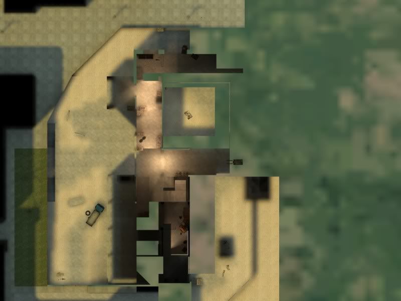
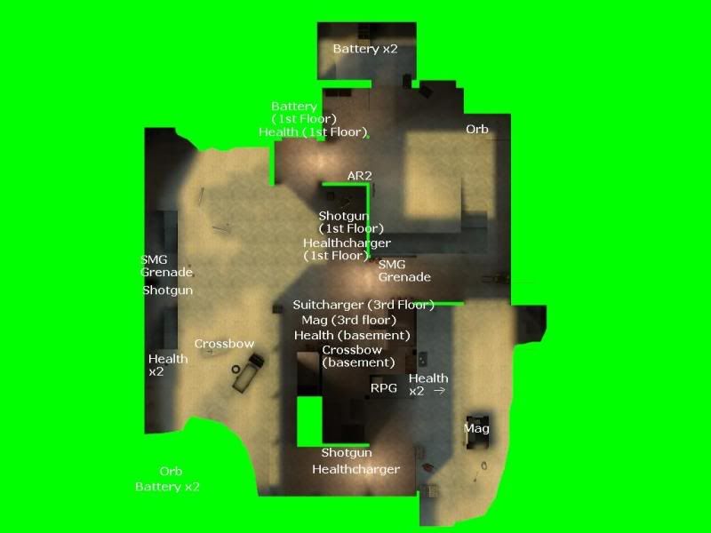
Save another release, I've posted what is currently the rc3. I've noted the feedback, which has been very helpful. Note the layout shot for the weapons layout. There are now 2 orbs, one in each corner of the map. 2 SMG Grenades placed individually as well. The AR2 is above ground as suggested. Crossbow and Mag are swapped as suggested. RPG is now inside a fence, entry only by vent, cannot be phys-grabbed from outside the fence.

Image

Basement area has been redone to be more spacious, less opportunity to camp, no AR2, crossbow has replaced this. And RPG is accessible only by ladder upto fenced area (see above shot).
Image

Fenced area (previously housing the RPG in rc2) has been redone. Field of view is now not as good, so less camping there.

Image

Image

Zman42

2009-05-24 00:34:11

Nice! I cant wait to test the new one out, and this saves me from posting more or less exactly what grain said. 1 question though: did you remove the staircase that goes up and down with no purpose? I really would take that out if I were you...

Sadist

2009-05-24 01:19:43

Zman42 wrote:Nice! I cant wait to test the new one out, and this saves me from posting more or less exactly what grain said. 1 question though: did you remove the staircase that goes up and down with no purpose? I really would take that out if I were you...
Yes, I did. But, really what is the problem with the staircase? It was in a corner, out the way of anybody tripping over it. It just feels really pedantic. The staircase provides aesthetic in a low detail area of the map.

Nutri-Grain

2009-05-25 02:13:42

.

Sadist

2009-05-25 02:43:18

OK.

boshed

2009-05-26 03:47:22

This map just gets better and better! Can't wait to see your final release.

Sadist

2009-05-29 23:01:22

Hi guys, I have now released the RC3

RC1 has been removed from the links, so people can download rc3 below and at top of thread.

http://www.mediafire.com/download.php?hghjyinmm0q

Sadist

2009-06-04 15:33:40

Hi all,

Some updates to Jaeger.

11 x Healthkit
10 x Battery

Due to feedback the map sorely needed more health and batteries.

2 x 357
2 x Ar2
3 x Crossbow
3 x Shotgun
1 x RPG (accessed through vent - 5 seconds)
10 x Frag Grenade

Healthkits and batteries positioned outside the building along with AR2, Crossbow, Shotgun and various ammo kits.

357s and Crossbow inside and nearby the building.

Inside the building are the mag and crossbow, but the team have to keep moving out the building to get access to healthkits. Team not occupying the building have the advantage of having better access to healthkits and batteries and AR2, but will have to get inside the building to access the 357.

Sound good? Maybe more weapons needed as well?

Vendetta7_7_7

2009-06-06 07:23:14

I really love this map...but the link doesn't work for me....argh!!!!!!!!

Sadist

2009-06-06 14:36:21

I fixed the link. The website i upload to seems to break links occasionally.

Vendetta7_7_7

2009-06-06 19:57:25

Thx gonna dl and check out the revision..

Sadist

2009-06-07 00:56:19

Vendetta7_7_7 wrote:Thx gonna dl and check out the revision..
Just to check - the latest revision has not been released yet, still editing it and playtesting.

Vendetta7_7_7

2009-06-07 01:11:03

Sadist wrote:
Vendetta7_7_7 wrote:Thx gonna dl and check out the revision..
Just to check - the latest revision has not been released yet, still editing it and playtesting.
nice. I just got a chance to hop around the latest revision and I like it a lot. I like how you hollowed out the rpg spawn and created the open path to where the shotty would be next to the little elevator. Seems more balanced now with less smg nades and spawns but I'm still trying to get used to it not having as many like in rc2. Does seem like its missing alot of ammo and weapons but I guess everything is more spread out and strategic.

All in all its getting betta and betta lol. :mrgreen:

as a side note: I really like rc2 version for pub play. I wouldn't scrap that version. Every version tho, looks beautiful and refreshing. Its got this kinda sheen to it like Mirror's Edge or something. Nice work mate.

Sadist

2009-08-15 03:03:49

The map is now in RC4 version.

More healthkits, mag and crossbow inside the building and outside are ar2 and shottys.

Please download and enjoy.

Download - Download Here

[FF]FNDR.Jake_Brake

2009-08-27 08:17:32

Thanks man for all your hard work! I will download this version this weekend and give it a spin!

lead

2009-08-27 16:42:28

nice m8 :D

Jelly Fox

2009-09-28 15:34:47

love this map