beta_illuminare

[MB]Brunt

2009-07-13 19:19:34

howdy folks.ive been workin hard on beta_illuminare.i started out planning to make a quick simpel map.but the map need more than i what could do with stock textures and props,so ive went with mostly coustem texturs and props.this has bumped the file size up to57 mb.i know its a bit big but i think its what the map needed to look rite.this map is a huge leep forward in lay out for me.id like to think vallar,haymaker,pigpopper,boshed and juim for all thier help.thes guys are truly kings among men.atm im still in beta till i get some play testing on this verson(need to see how some of the props do damage in game)input allways welcome.

http://www.filefront.com/14032239/beta_ ... 06.bsp.bz2

Image

Image

Image

Image

Image

Image

Image

Image

Image

{EE}chEmicalbuRn

2009-07-13 20:02:26

looks nice. down loading now

Da1

2009-07-13 20:39:29

Hey man, I really like this one, I've been playing it a lot on Jake's servers and I hear nothing but compliments, keep up the good work!

boshed

2009-07-13 21:11:23

That's quite an update :shock: Will have a run round when I can and get you on friends.

Jelly Fox

2009-07-14 00:38:03

looks well decent 8)

keefy

2009-07-14 02:07:09

The credits text is in the way of the cross hair, thats my only critisism.

haymaker

2009-07-14 03:54:26

Nice work Brunt, this is shaping up to be your best release yet. Some good improvements here too.

Some crits:
-can still camp teleport destinations easily
-idk about having the slams so accessible
-set your env_fire damage to -1 unless you like it the way it is, and check them in the OB mod
-the skybox texture looks fine at high res but putting it at "low" makes it look pretty bad. I think you could put a few displacements in a 3d box and draw attention away from it a bit
-something about the clash between the blue light and the yellow one bugs me near the xbow hallway
-the pool area looks so drab compared to the rest in terms of lighting
-where is the fat filesize coming from?

[EYE] Valar

2009-07-14 07:10:47

Profoundly, honestly, deeply and utterly moved by this work. You are a wonder, Sir.
Don’t waste your time and choose your critiques carefully in this here eel infested cesspool!!! And move on. This is SOME magic you've pulled out of your hat.

WOW

[FF]Assn.Juim

2009-07-14 20:18:07

Got your file yesterday and had a run around the map. I agree that this is probably your best work to date. The crits I have are'nt so much technical as they are visual. First off, there are many texture alignment problems, most notably with the ceilings. You have chosen textures with very definite perimiters and they just look sloppy around the edges of the rooms. Easy enough to fix.
There are some poorly joind brushes here and there, most visible to me were the rounded edges you put in the courtyard area windows below the supercharger.They need cleaning up in a few of the joints. The RPG room.Basically, once you get it, everyone who enters becomes RPG fodder. Since(and this is a really big plus about the map) you have tons of FPS to spare, I would adorn that hall with some colums to aid in gameplay balance and to add visually to that rooms theme. Also in the outer areas, there seems to be plenty of opportunity for cross beams or something,I don't know???. Just seems like there should be more architecture to get a purchase on, both to aid in z-axis and player movement. The ambient sound is full of subtleties like birds and such, yet I see no evidence of even one tree anywhere, except for the Ivy hanging down. Perhaps, as haymaker stated, you could spruce up the skybox outside the map with some tree tops or some other foliage. This would also help to detract from the skyboxes failings he mentioned. Also, just an opinion here, you could open up the ceilings in a couple of those rooms to the sky, put some displacements/foliage etc., and some fades with those dust sprites which look so nice, just to add flavor (think dm_drift_revised here).The supercharger should be harder to get to. Some of the better players hang out there,supercharging, and fragging. They almost never have to go anywhere else. Finally, the double wooden door teleport could be made more attractive by say, opening the doors and revealing some kind of shimmering texture/light, or something, also to make it more obvious what it is. Keep in mind that these are just opinion based suggestions, and by no means are meant to detract from the map as it is. Nice job so far Brunt.

[EYE] Valar

2009-07-14 21:06:42

i just had to say this..

In a perfect world, this thread is how ALL maps feedback threads should look like. civil, to the point, mature and supportive.

[FF]Assn.Juim

2009-07-14 21:56:24

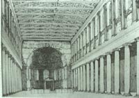
Kind of an example of what I meant in the RPG room.
Image
Not so ornate mind you, but you get the idea.
I'll have a few more comments in a bit.

[MB]Brunt

2009-07-14 22:55:06

haymaker i havent had to much trouble with camping the teleports mainly be cuse your an easy target if you camp that spot but if any1 eles is havin trouble with it ill look at moving them.i will drop the fire damage to -1 i did not realve it would go -1.yea the lighting mix under the blue lamp is odd almost cartoonish the blue light is a very deep blue ill try addinf some white.not what your sayin about the ob mod?? yea slam to accessable may do somthing like the rpg to make it harder to get.sky box hummm i love it not shure im gona do thr.not shure what to do to beef up the lighting in the back wher the water is ill get with ya on frends to speek on that.
Juim opps on the celing told ya i need a new set of eyes on the map good looking out on that.i realinged them.ive played with verous defrent arching and beeming in the rpg room and havent liked anything iv tryed yet so not shure on that.you have more playtest time on this than me so imput on game play is realy helpfull.when i test it i usualy have 5 to 8 players wich the size the map is made for and i can get the rpg and get out most of the time i allso like using the rpg sound to draw in others to a trap.super charger is you say easy to camp control ill have to think on what to do bout that i did add a sound "church bell" that plays when some1 is using it to give them away maybe that will help.
thanks for the props valar,comin frome you thay mean alot to me.

{EE}chEmicalbuRn

2009-07-15 02:37:59

just tried this map out. shit's mad niggerish my man. well done.

[EYE] Valar

2009-07-16 04:32:25

inputs:


some areas are still a bit too empty. physics? static props? something should go in.

in pic: betailluminarep060014.jpg - there are gaps in the joints of the stone panes and in general the wall is too thin. i'd widen it at least twice it's current thickness.

agreed about the dmg on the fires. it's annoying.

clipping is missing in quite a few areas in the map. go with the CLIP texture and smooth out everything.

the "underground" areas are indeed screaming textures oversize and wrong alignments as mentioned.

the teleports need a system that pushes the player away or you'll see trouble online. decomp dm_mudafuga you can grab prefabs from there.

i'd revisit the fire lighting using a spot_light upwards with low brightness, 40-45 outer and high constant and the actual light should come from a light ent that floods the area (no constant). the glow is very cool.

i'll post more if i see anything else.

again, amazing work from a beginner or any mapper at that. wonderful.

val